First Name*
Last Name
Email*
[
cancel
]
OVERVIEW
Quick Portfolio
Personal Work
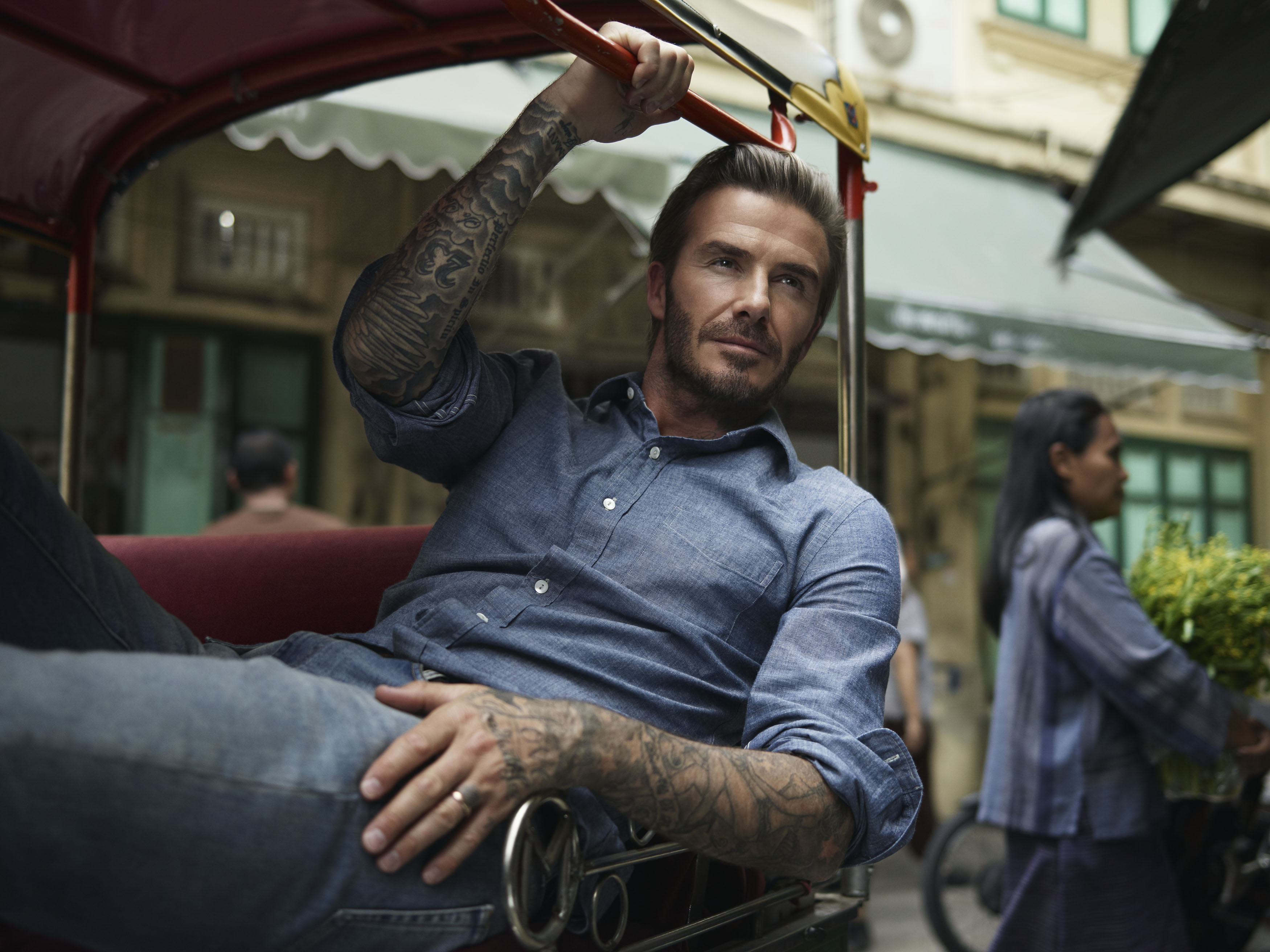
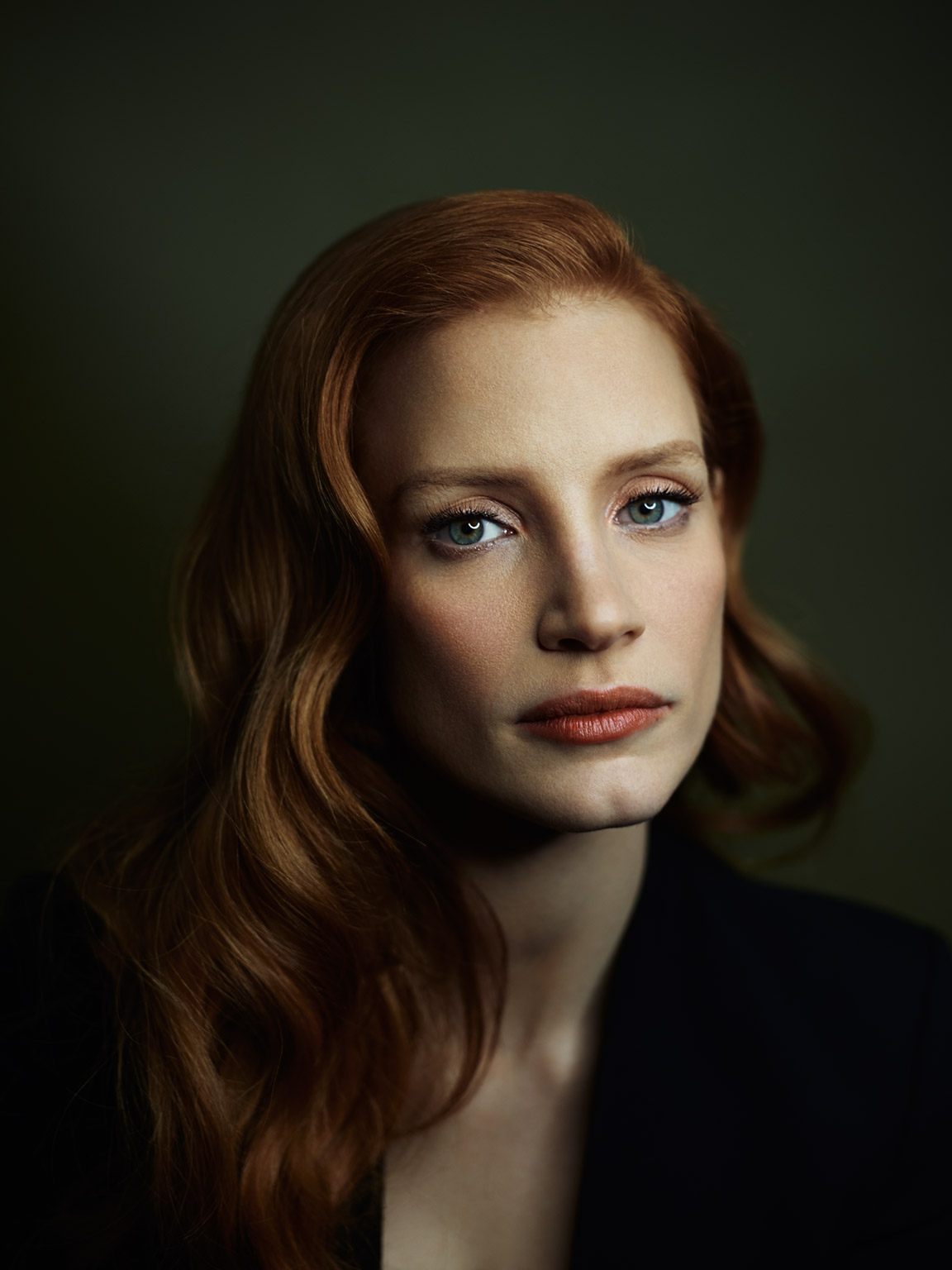
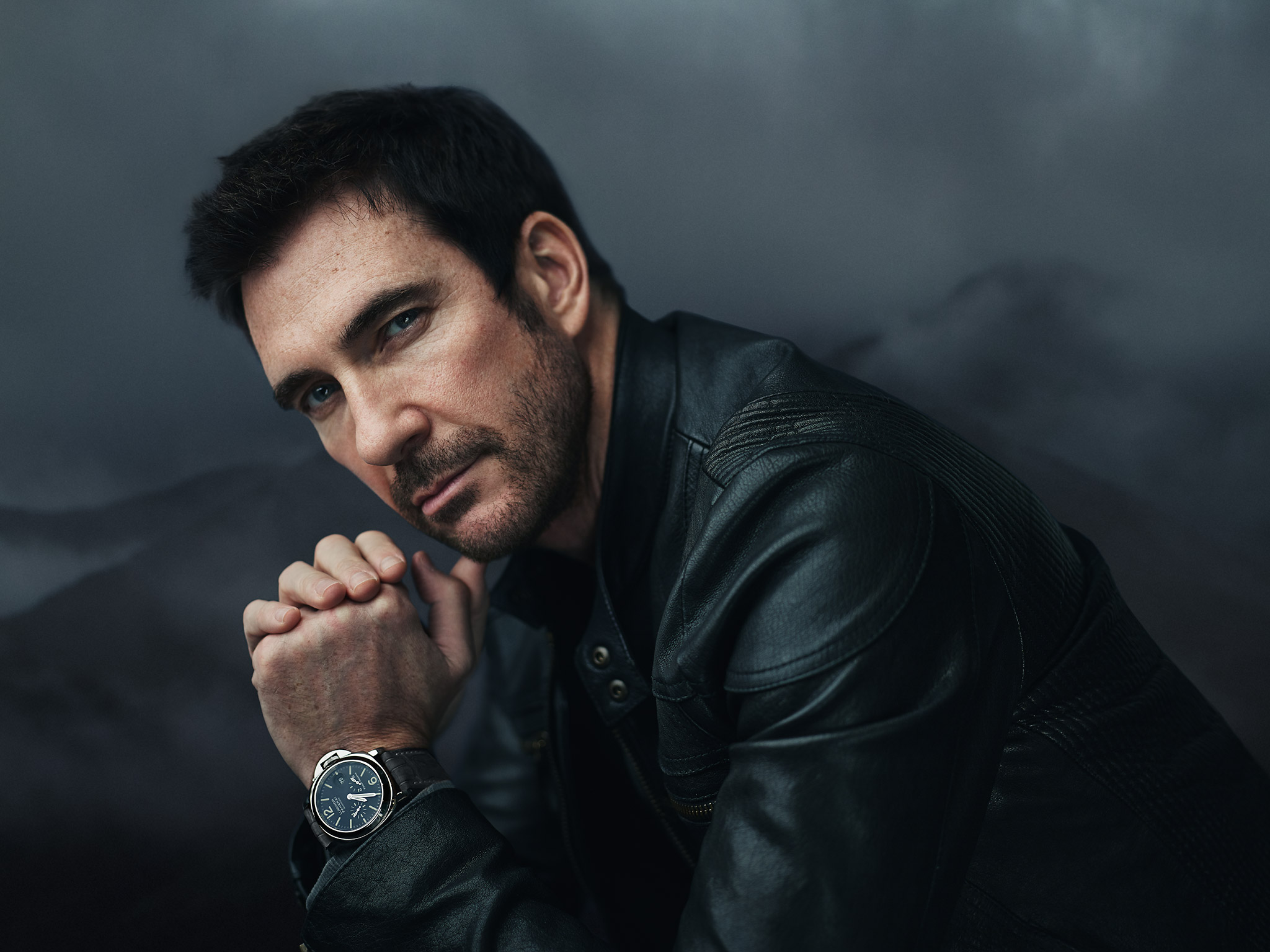
Celebrity
Ads / Tear Sheets
SELECT PROJECTS
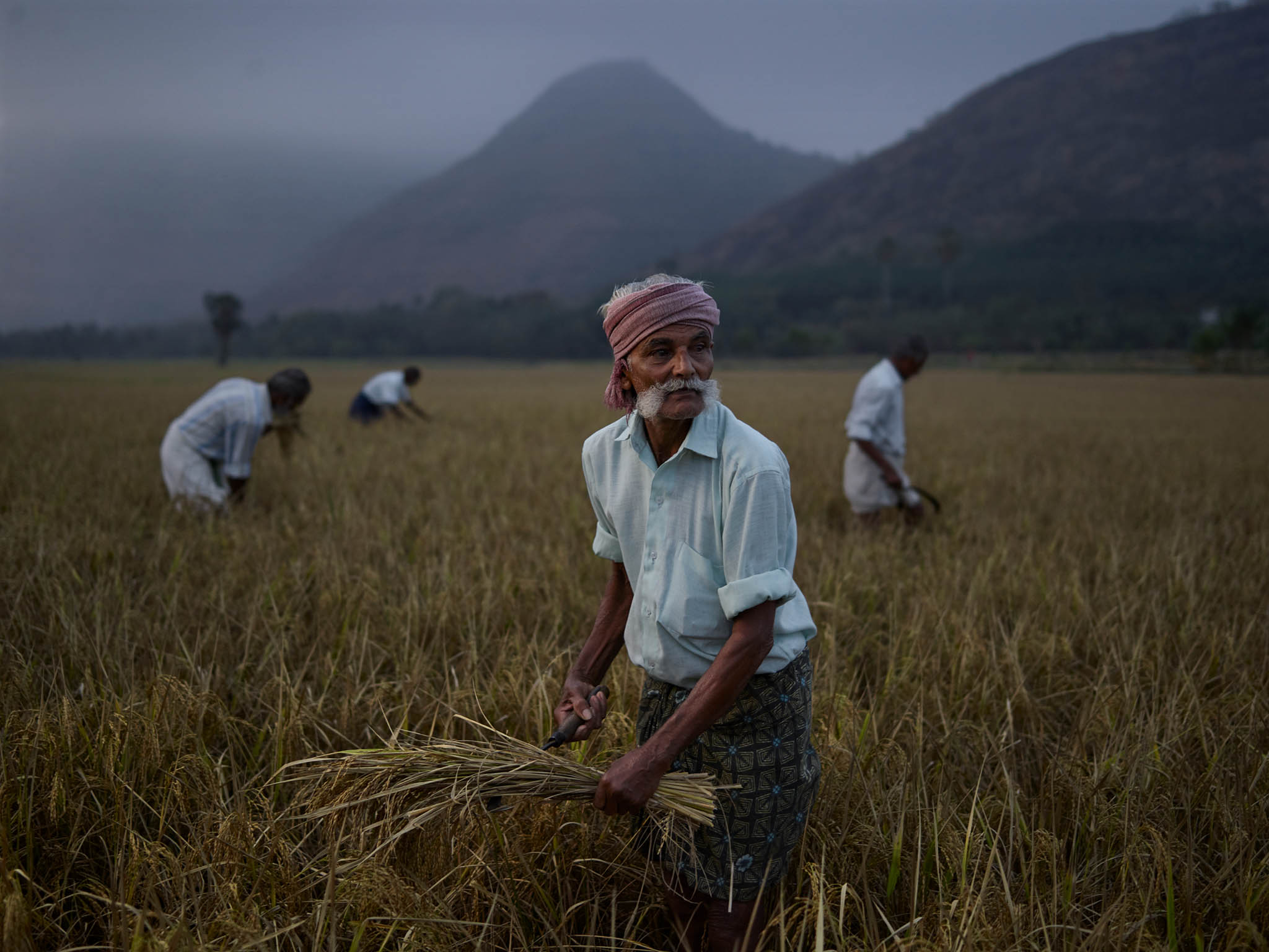
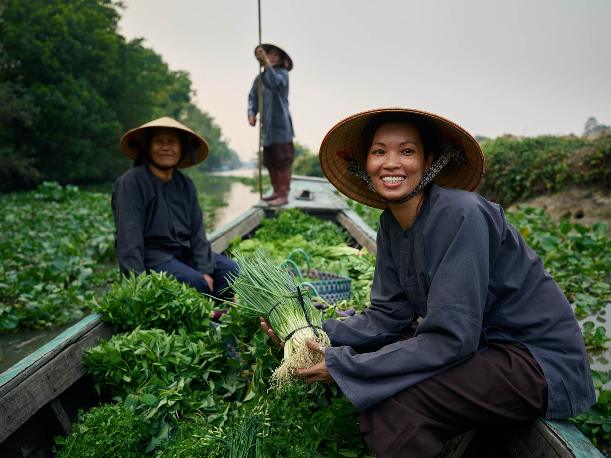
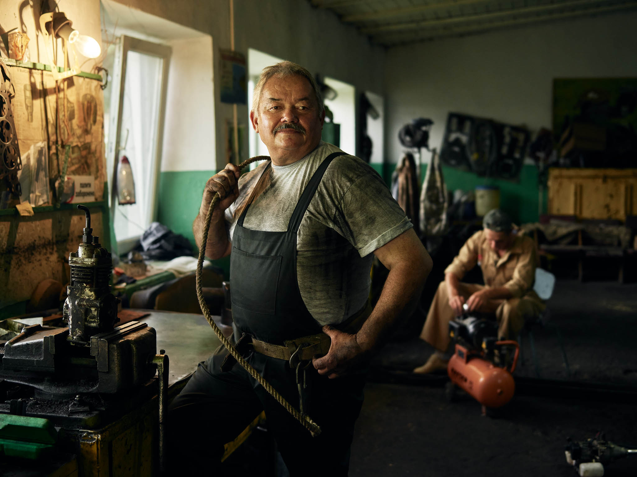
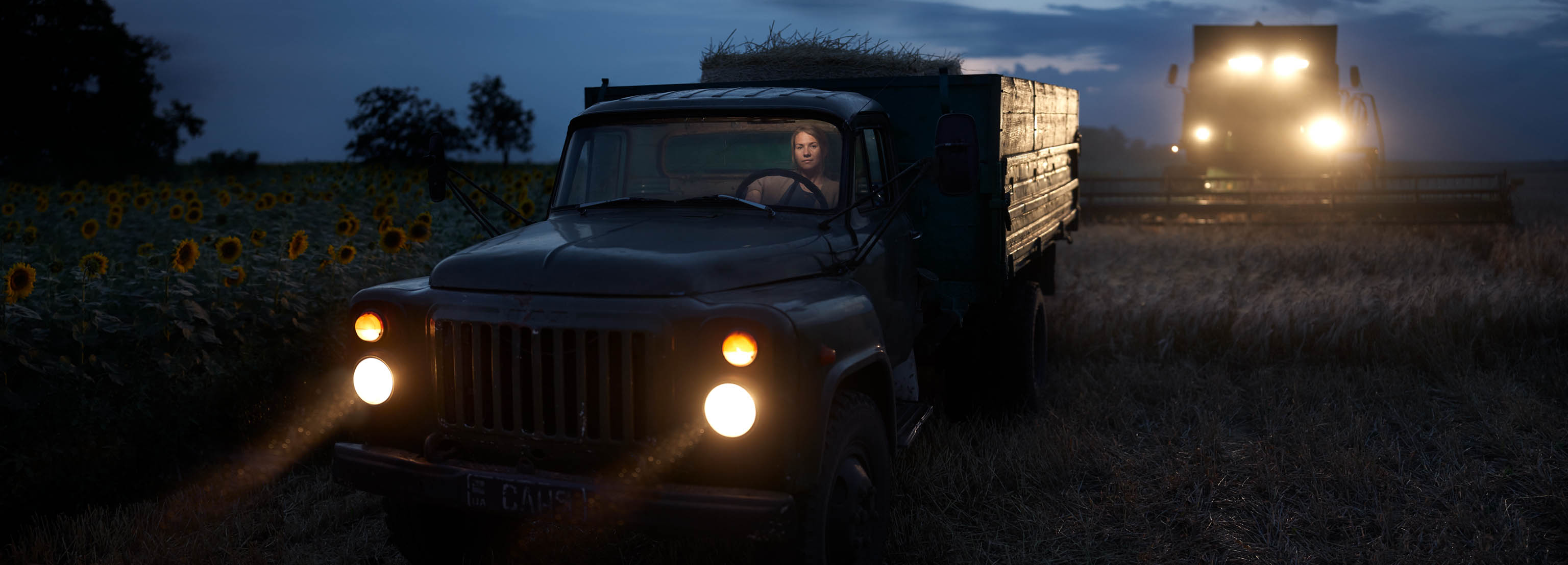
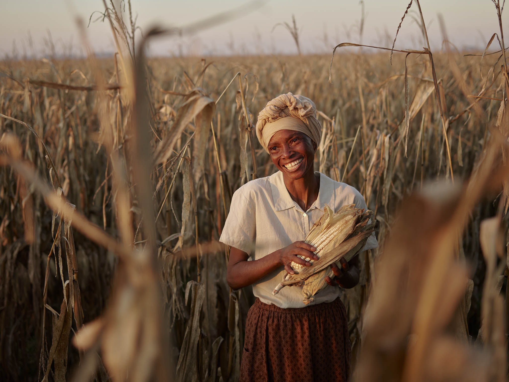
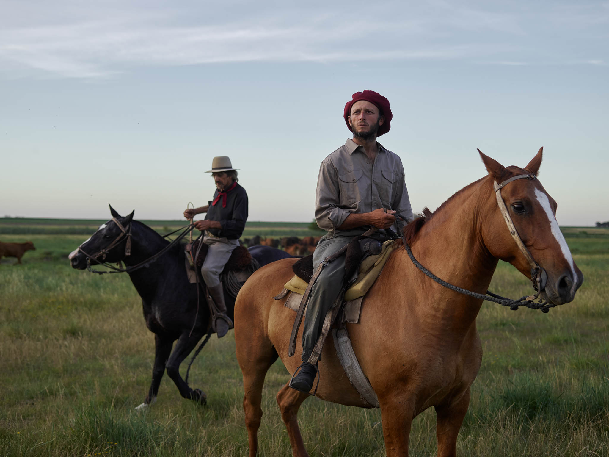
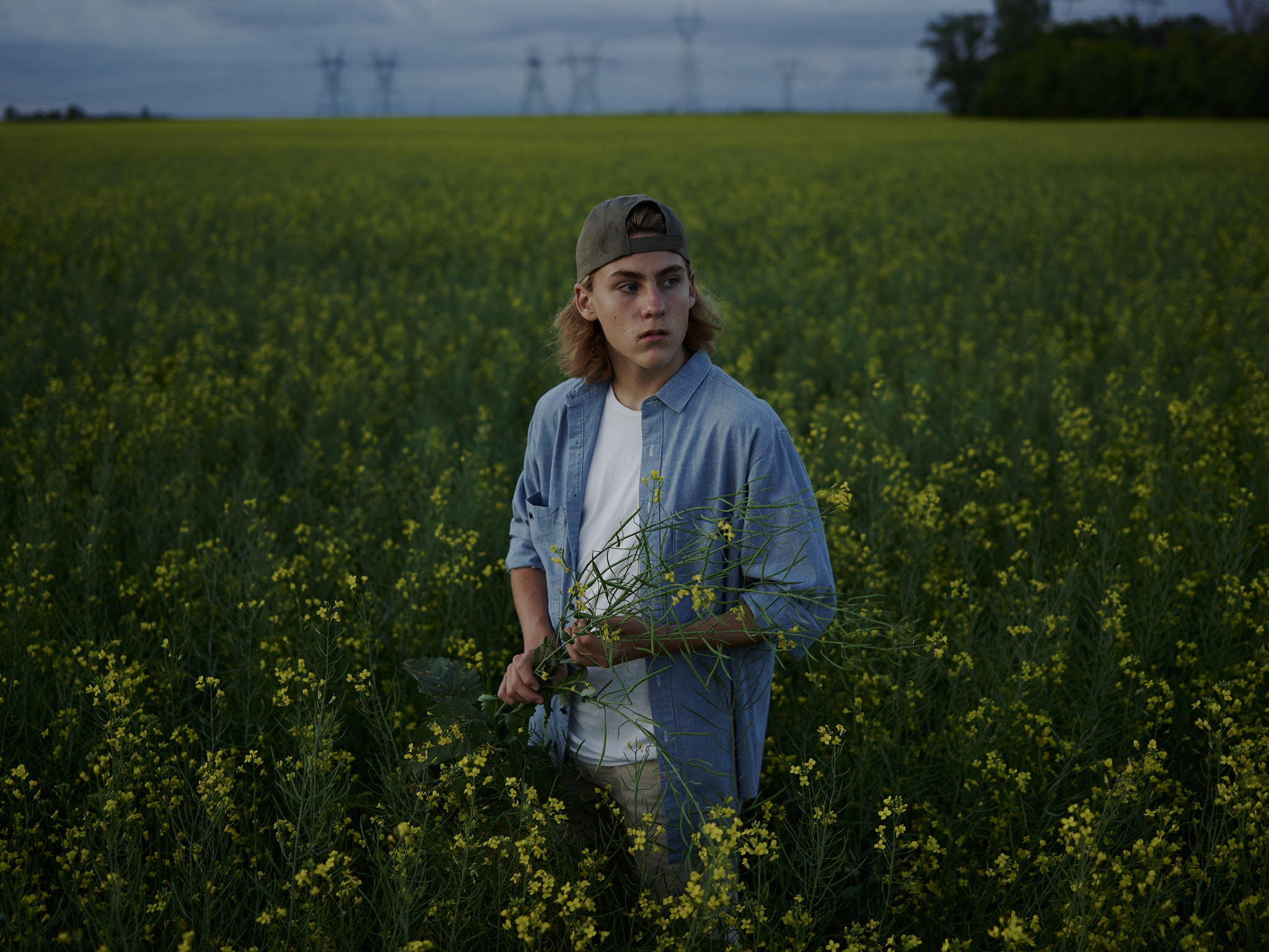
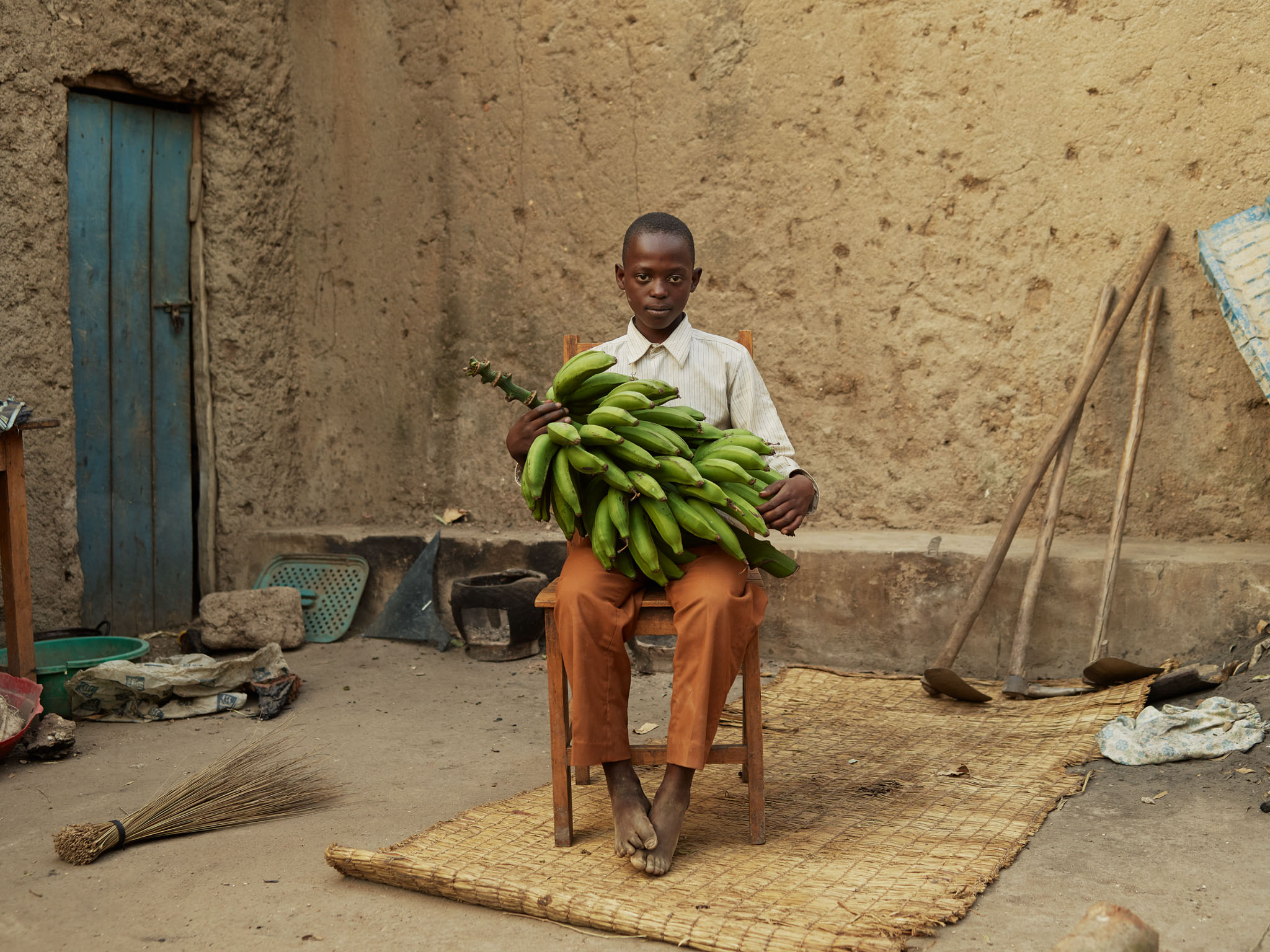
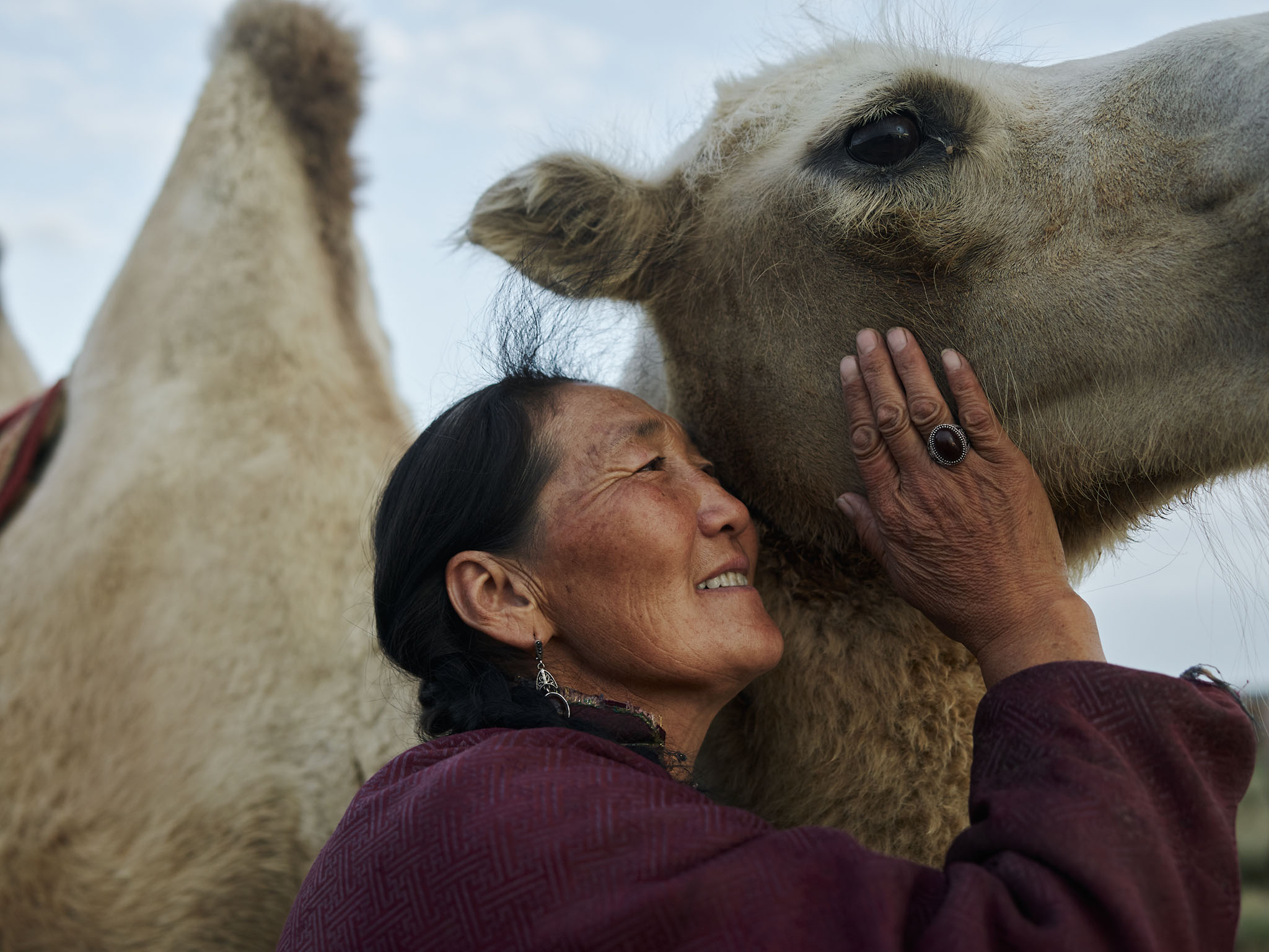
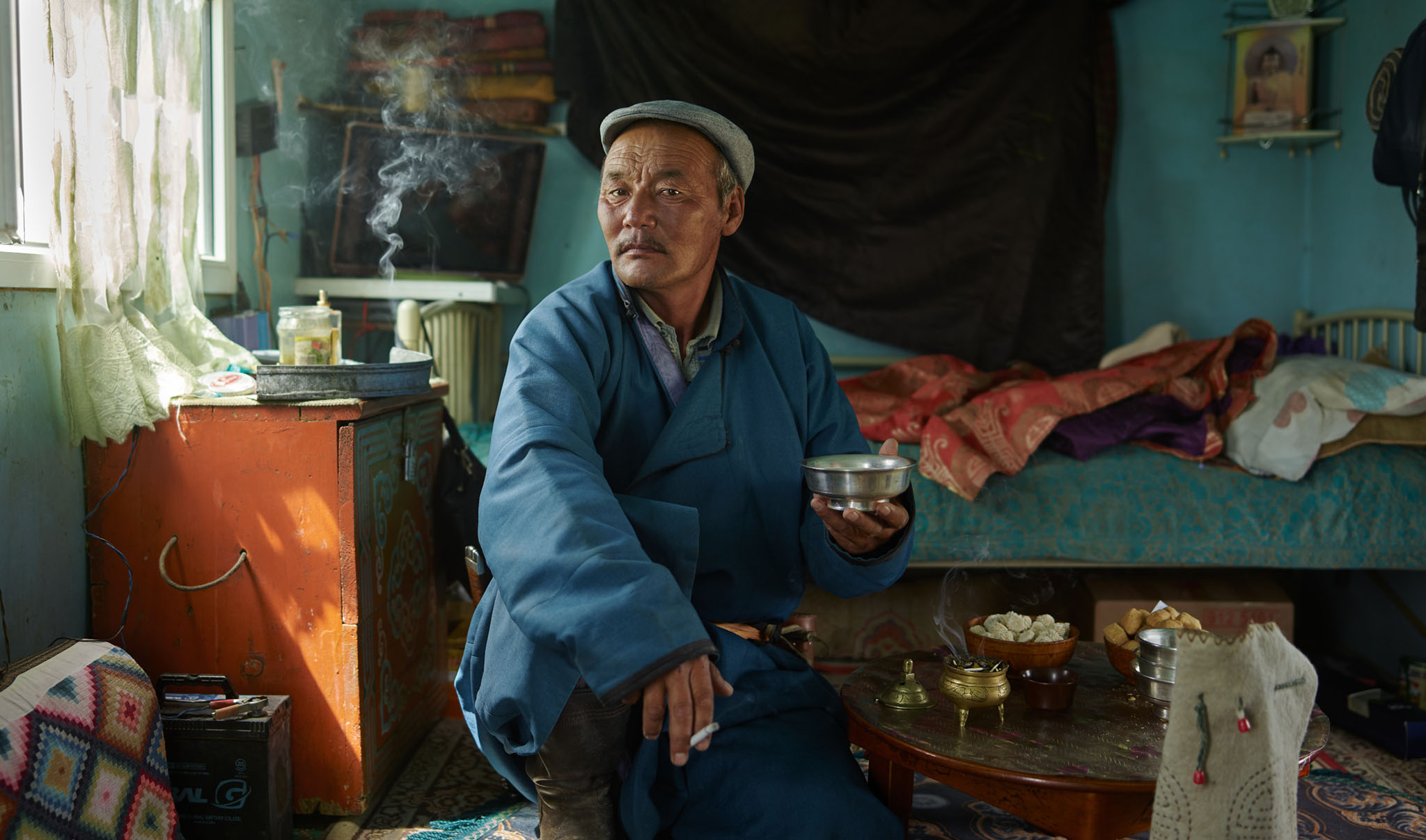
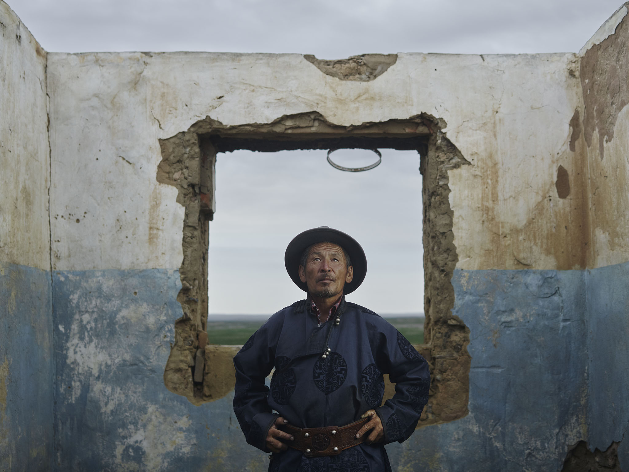
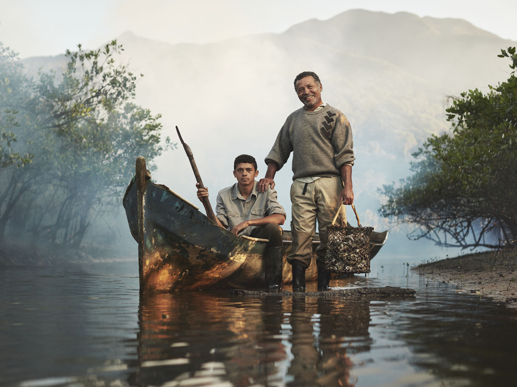
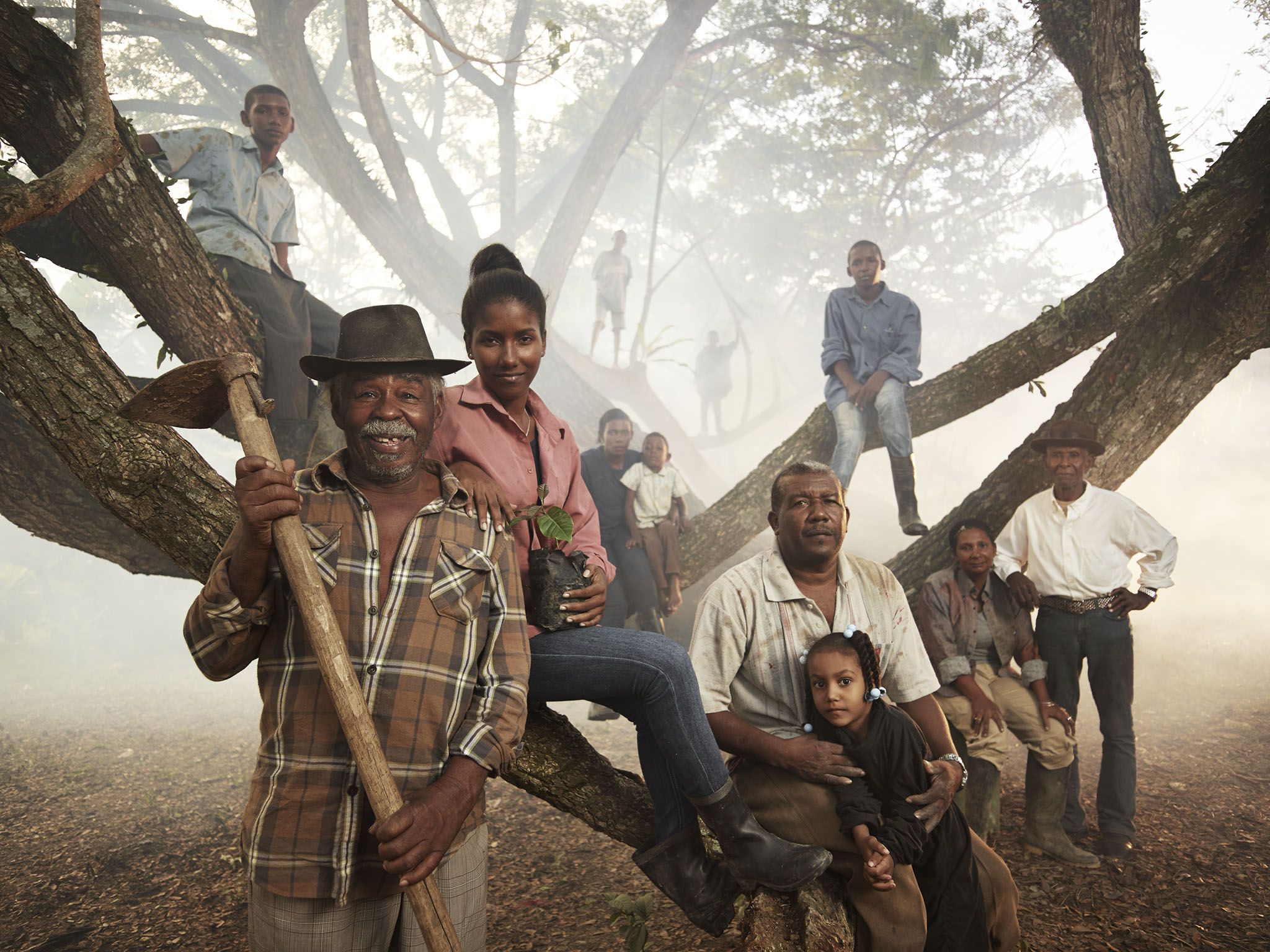
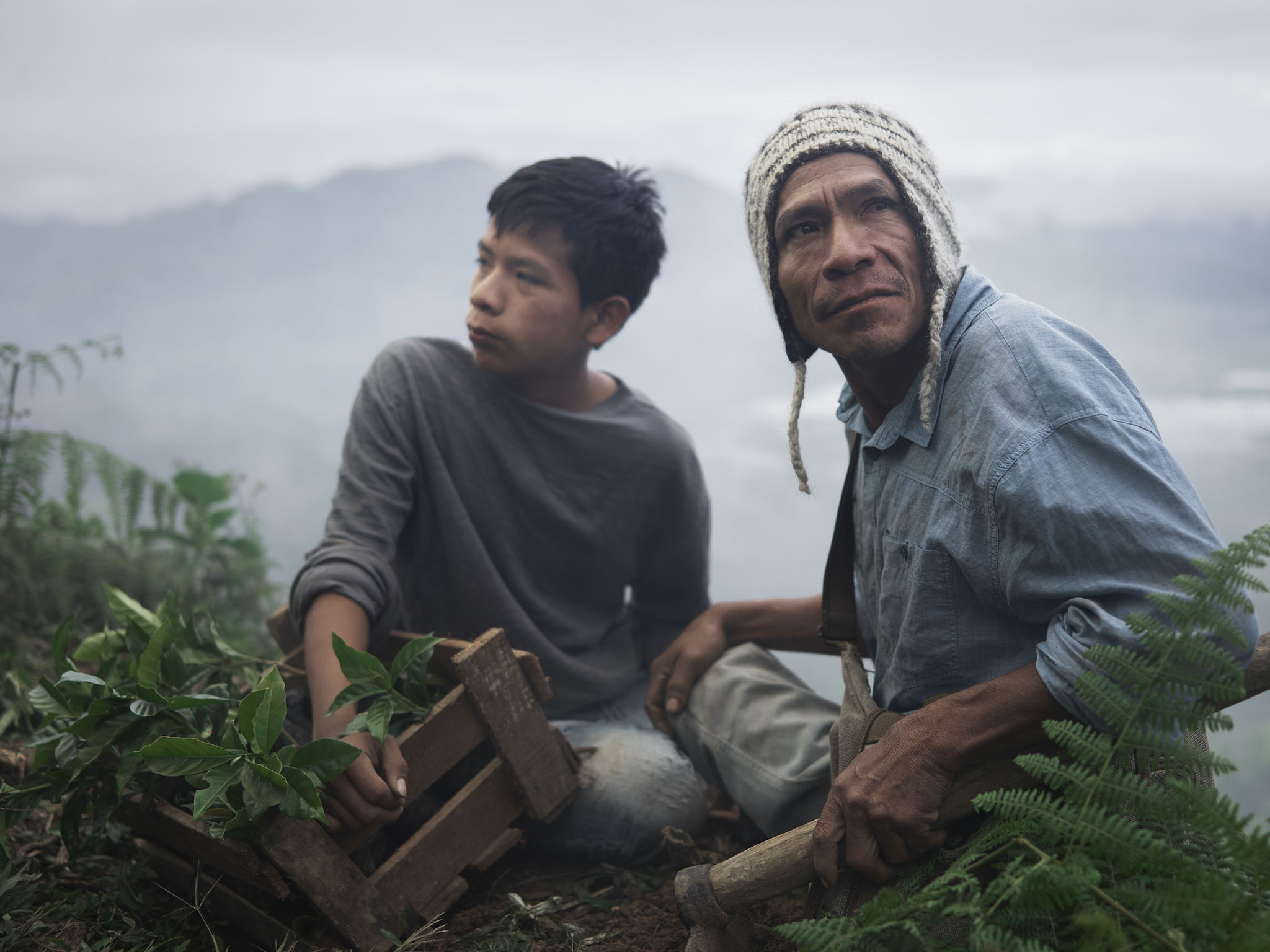
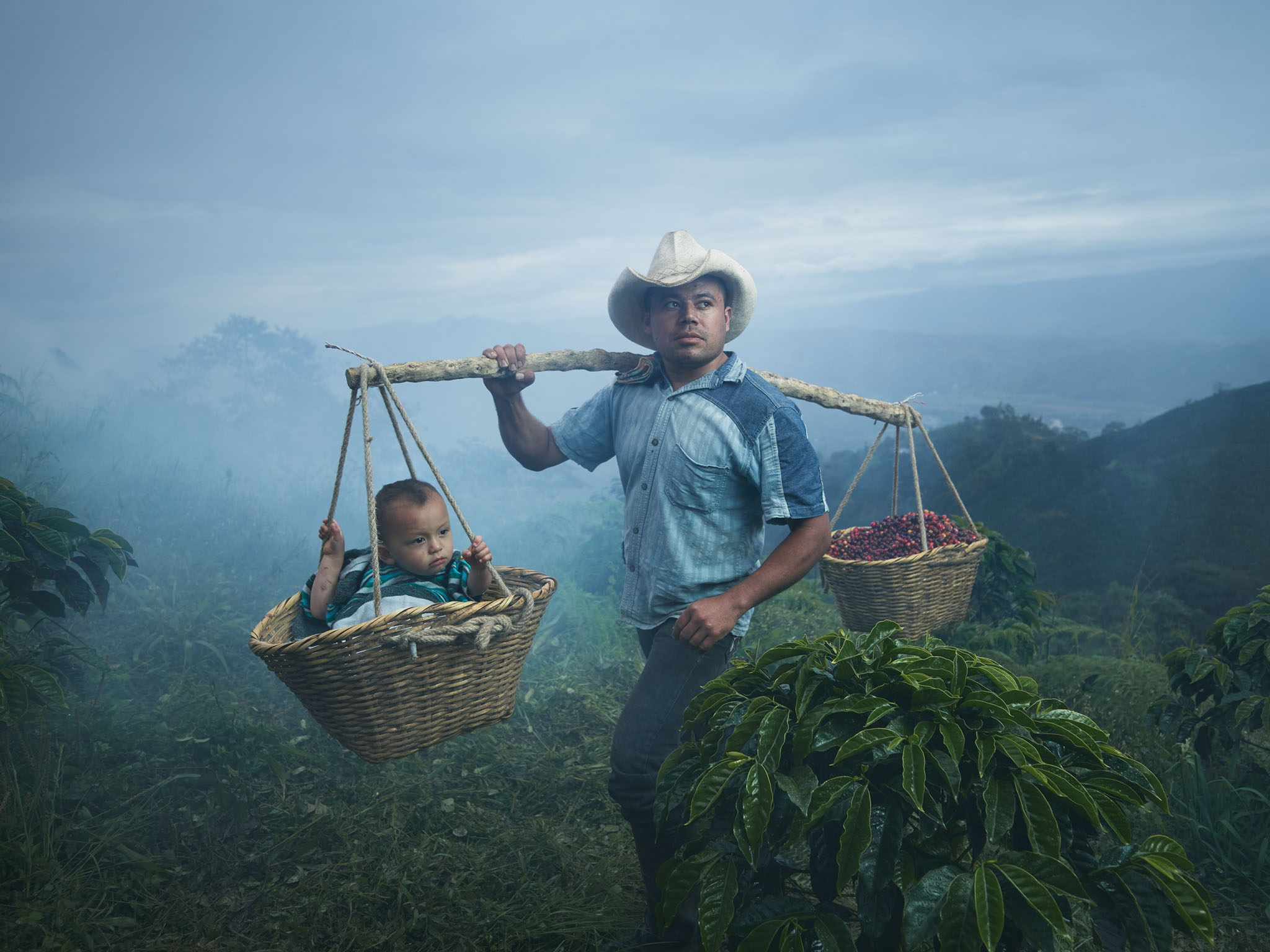
Global Agriculture
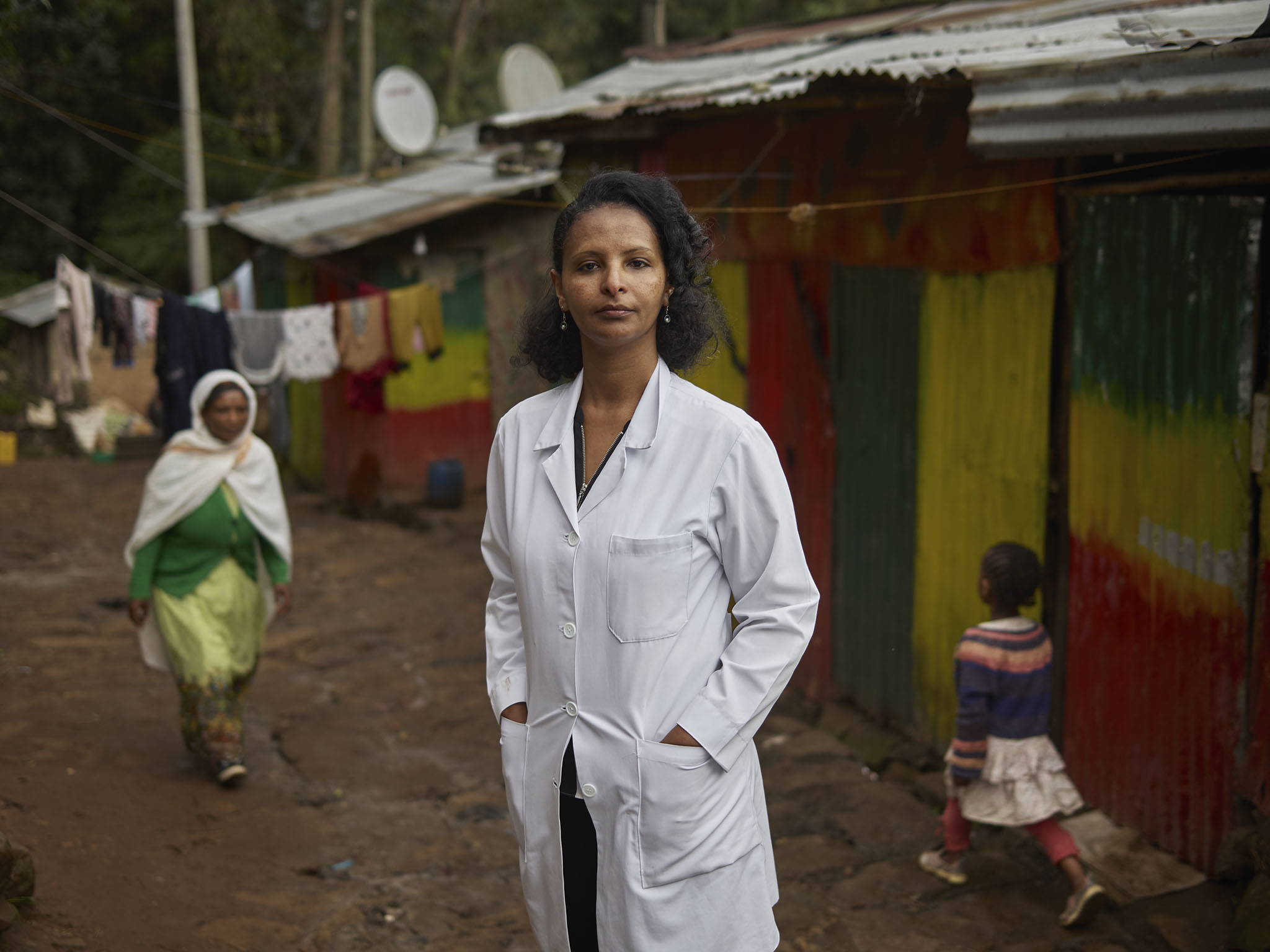
Global Healthcare Heroes
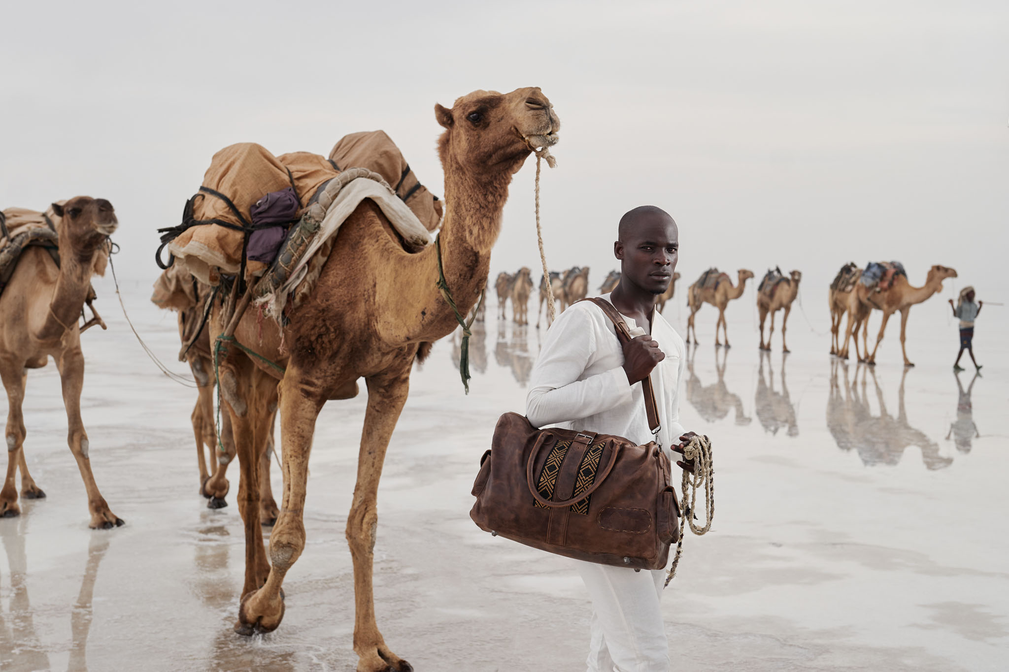
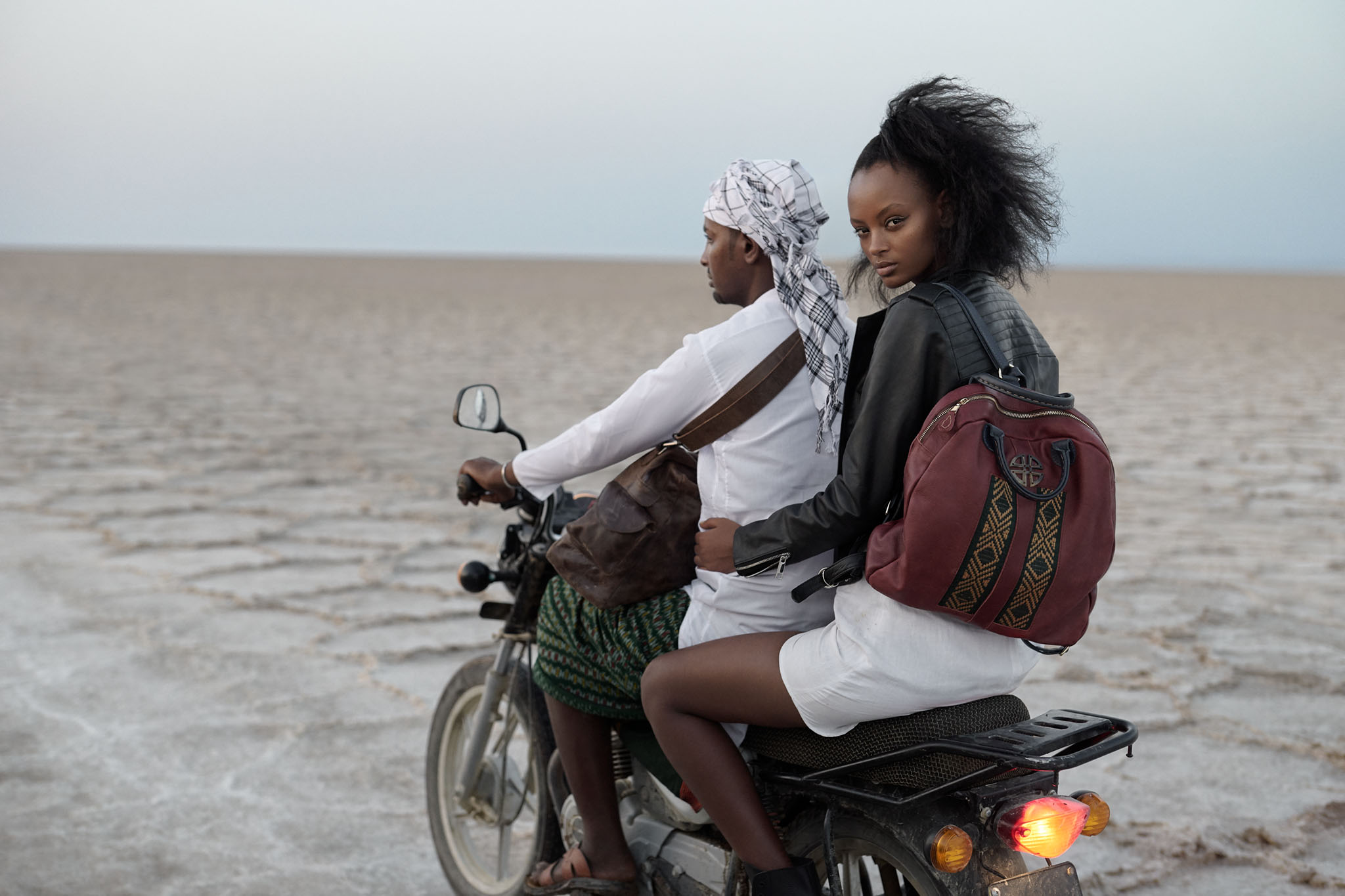
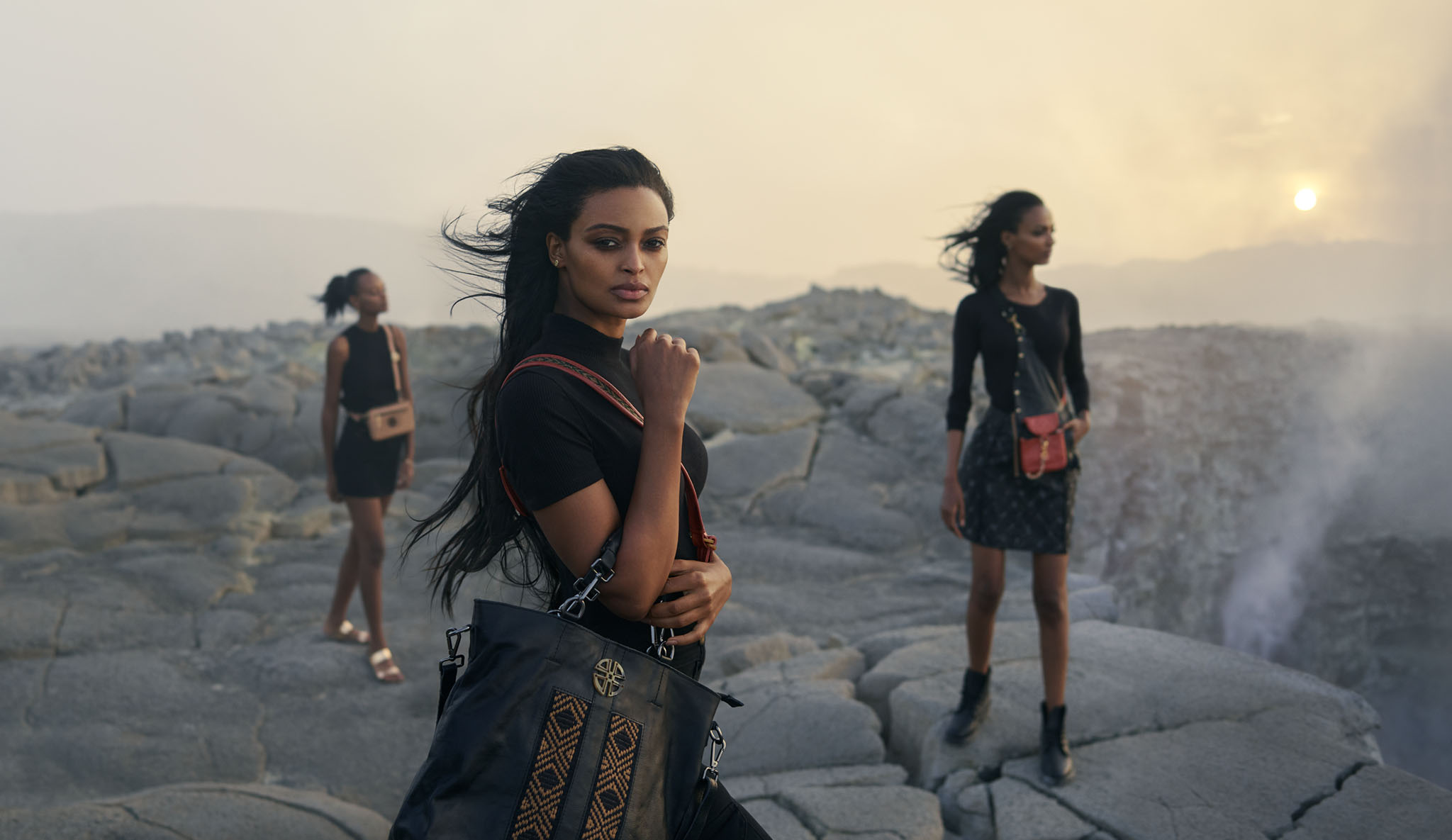
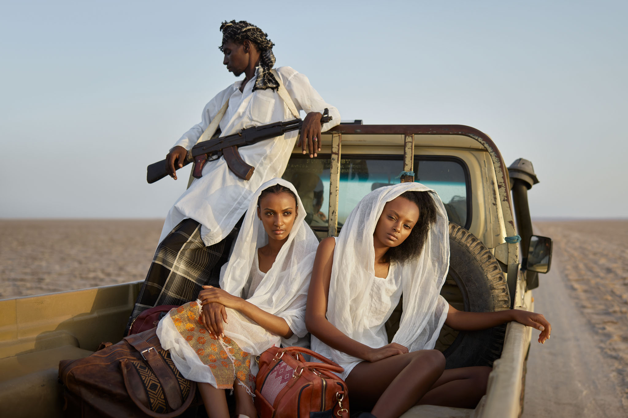
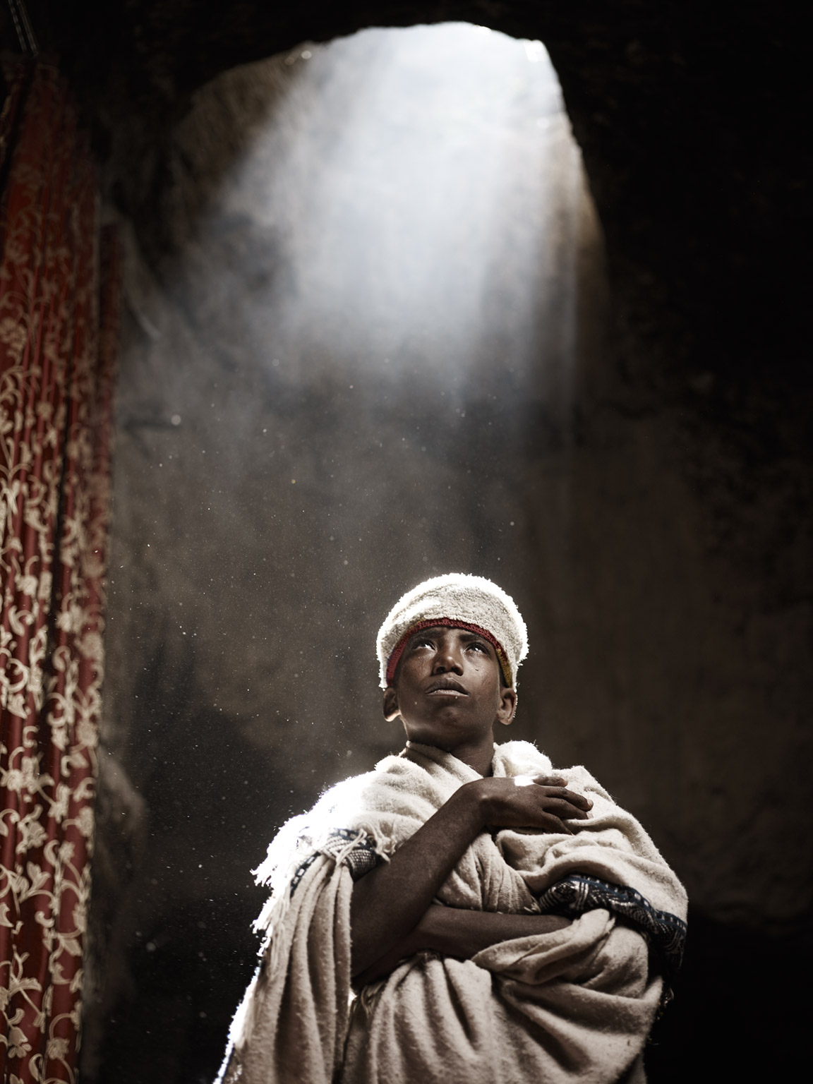
ZAAF: Made in Africa
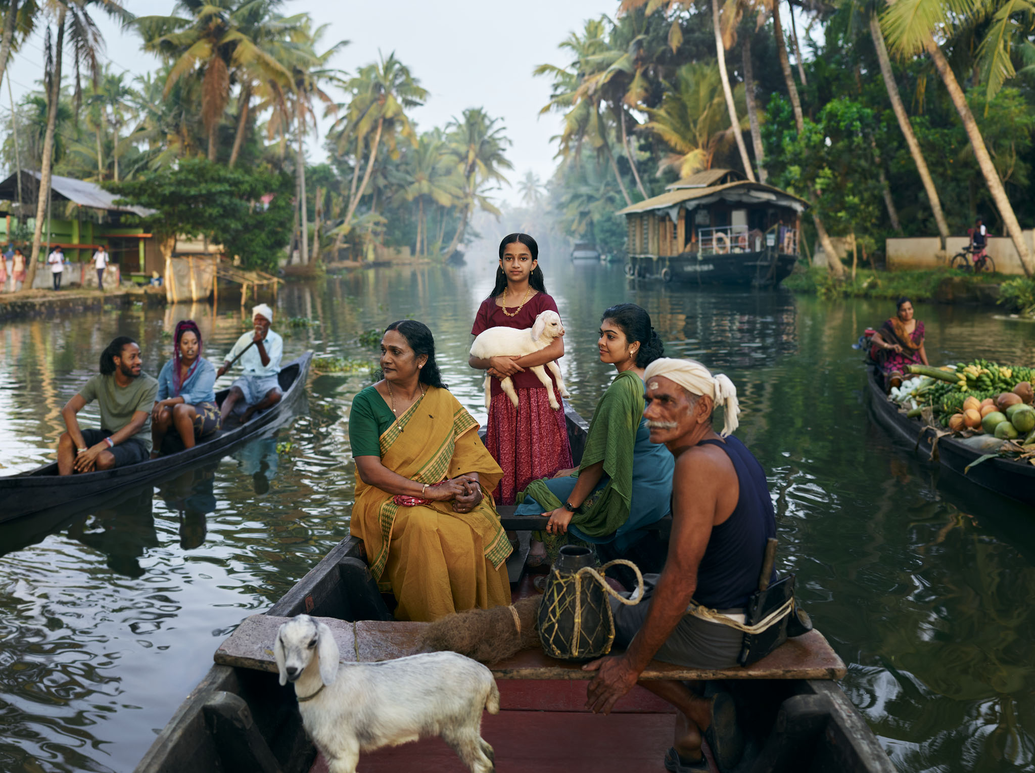
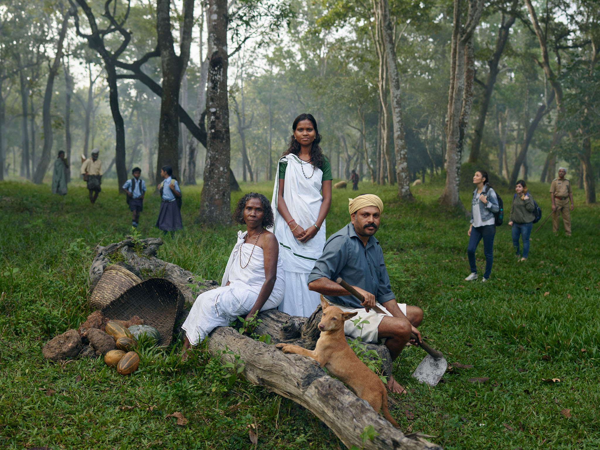
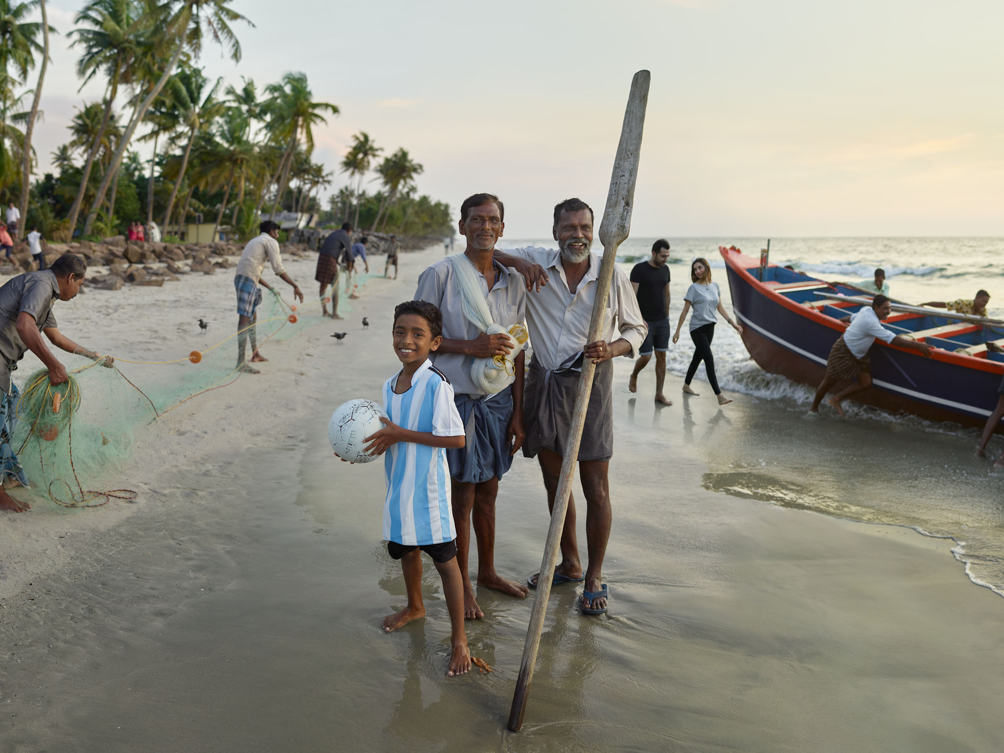
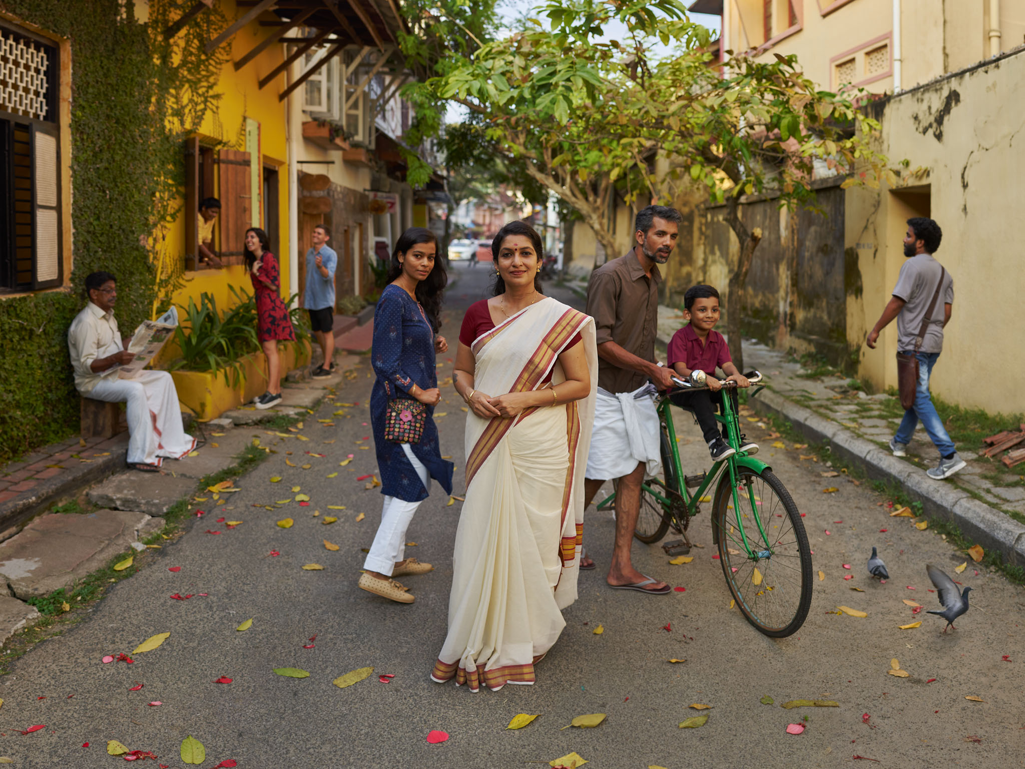
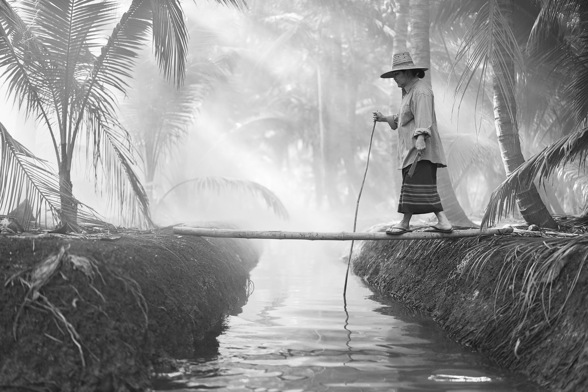
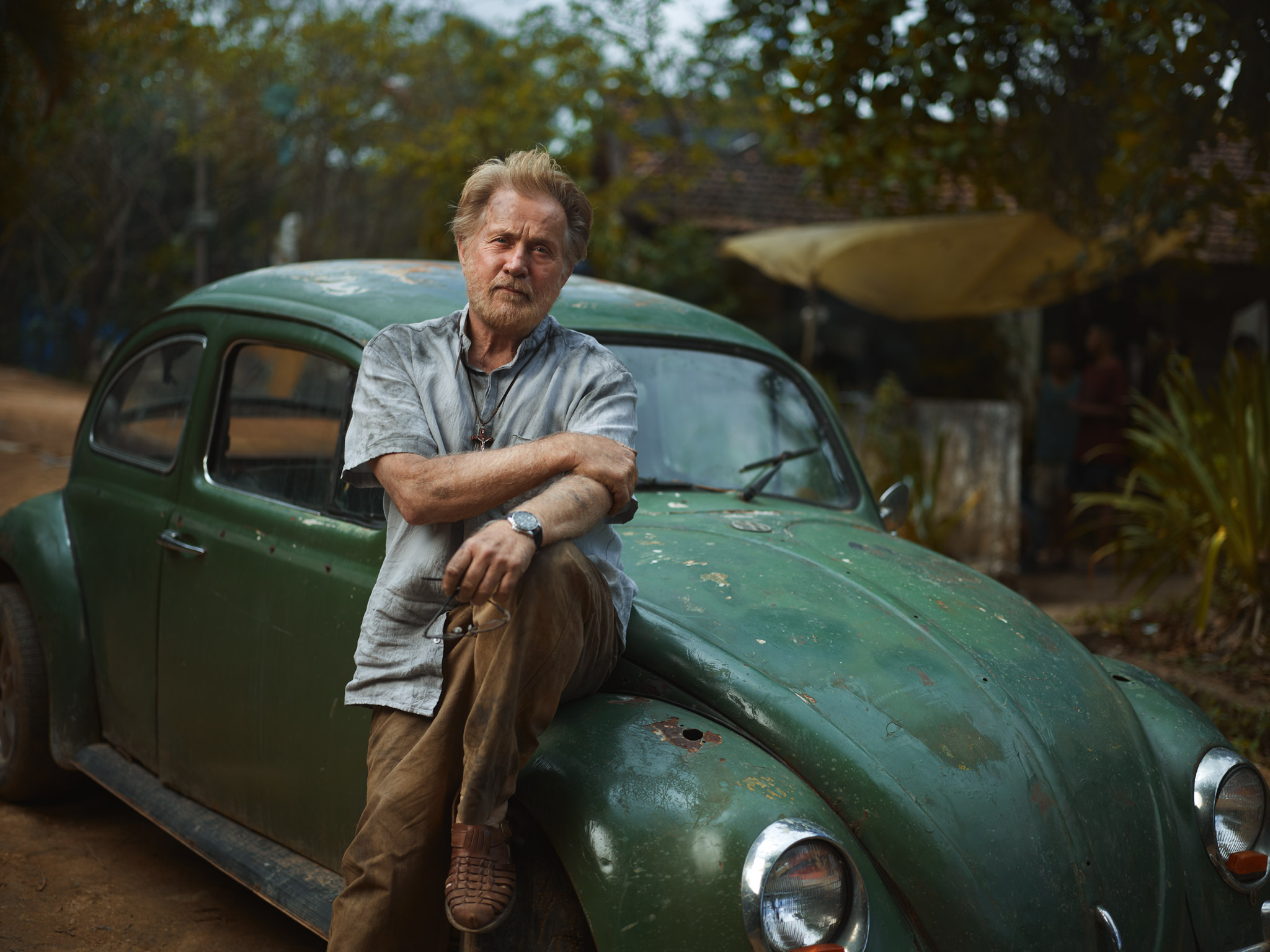
Kerala, India: Tourism Campaign
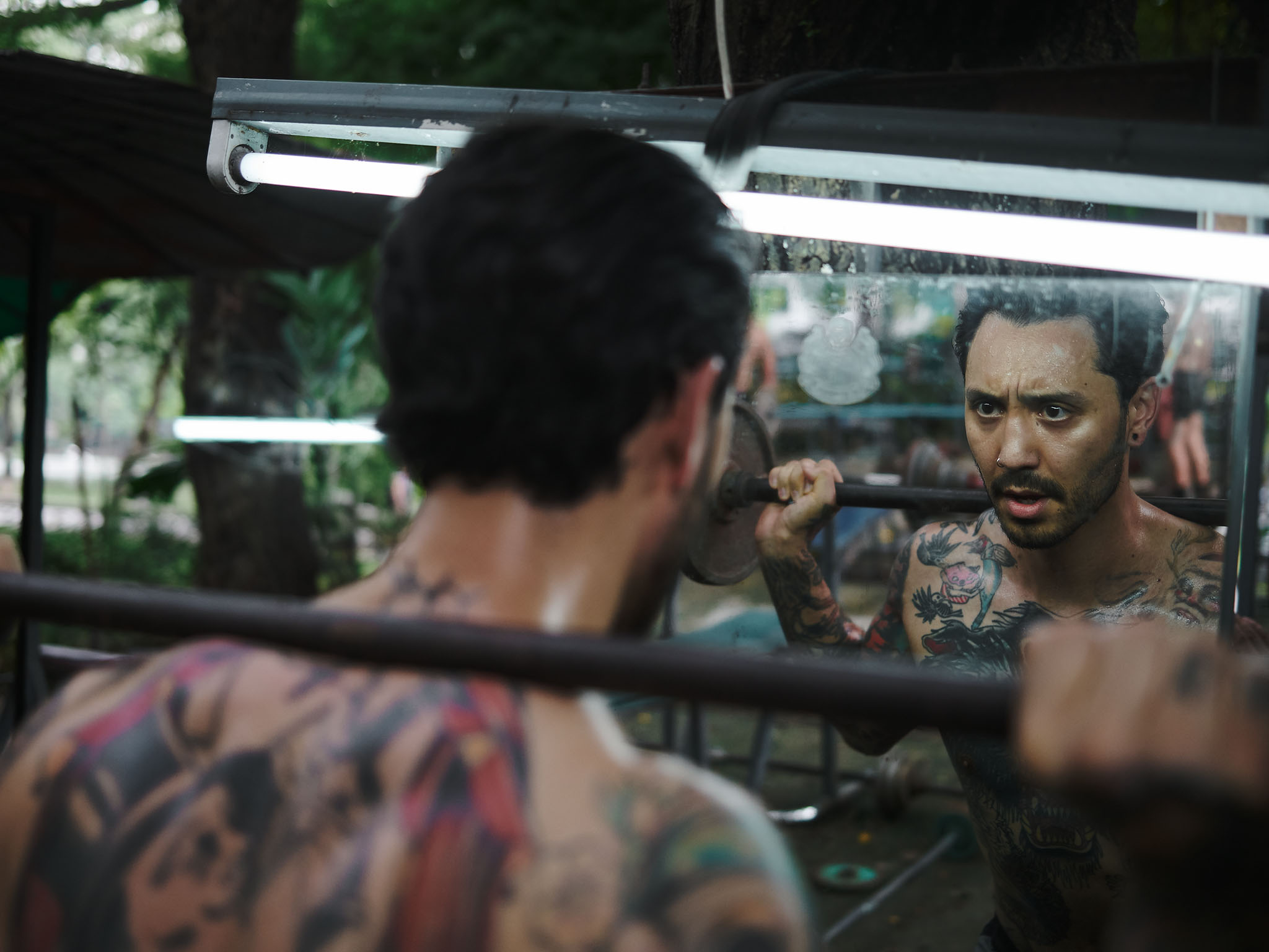
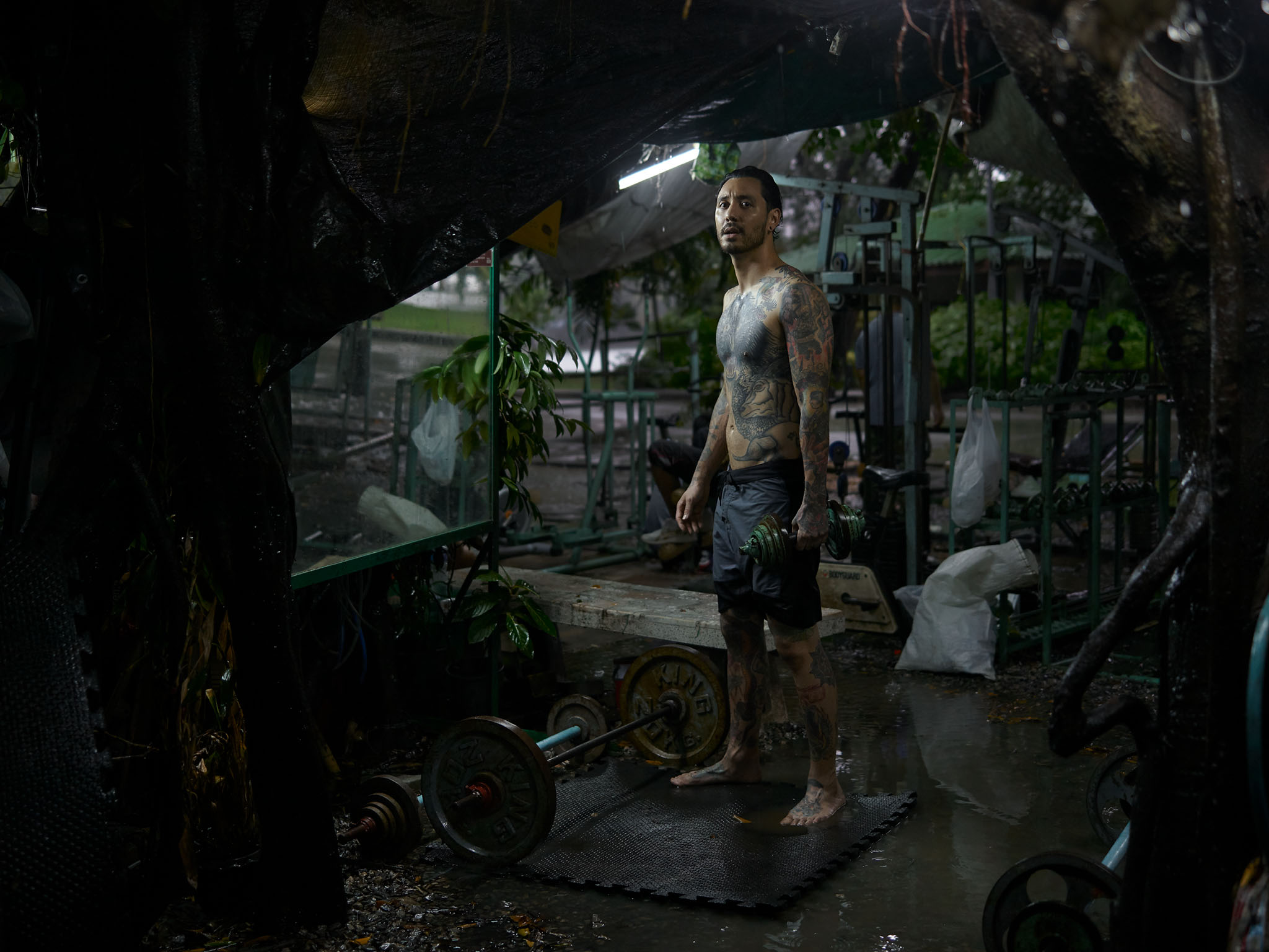
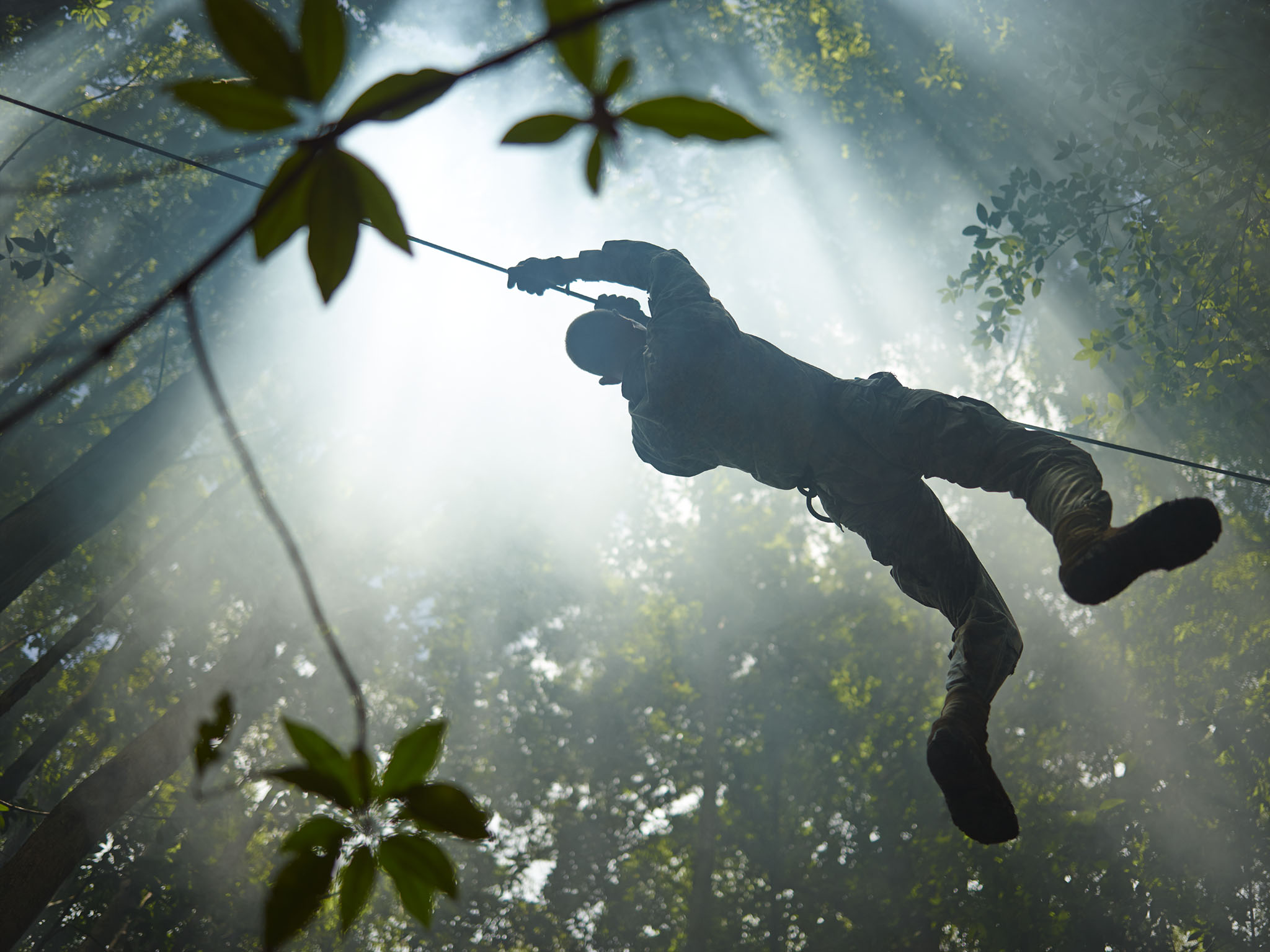
Jungle Gym
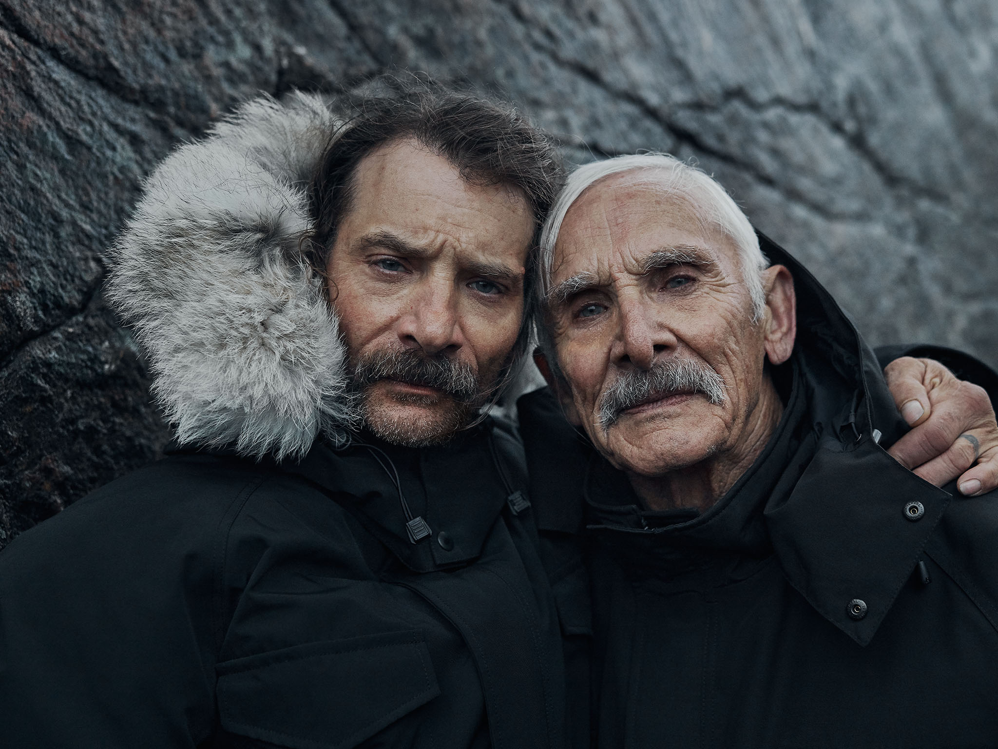
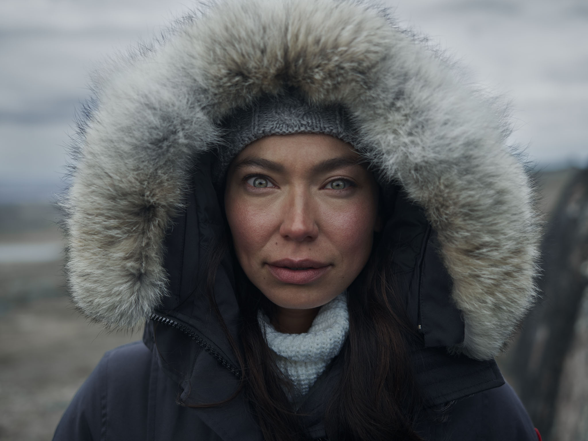
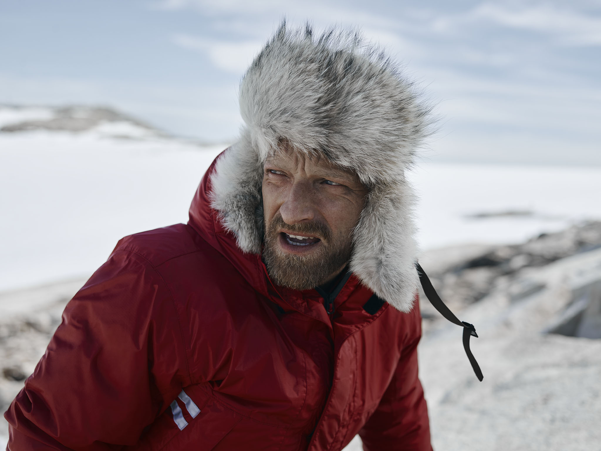
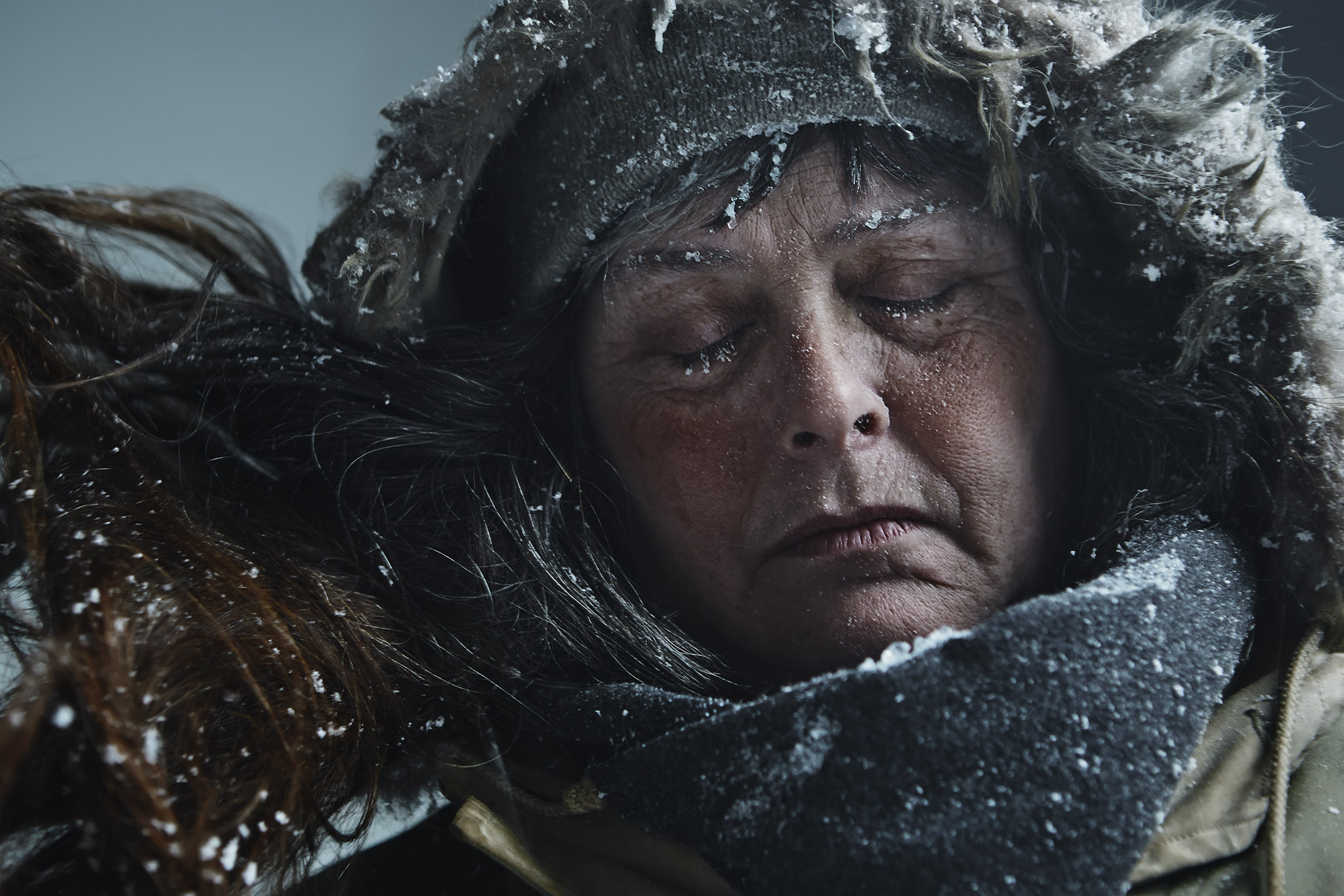
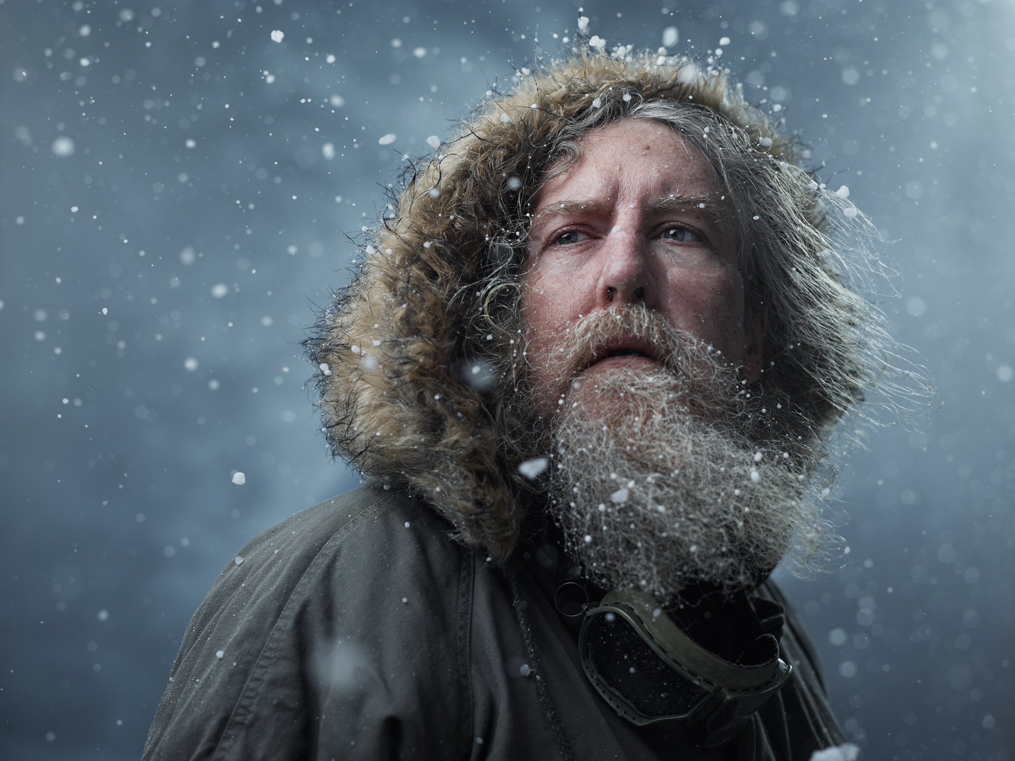
Canada Goose: Nunavut
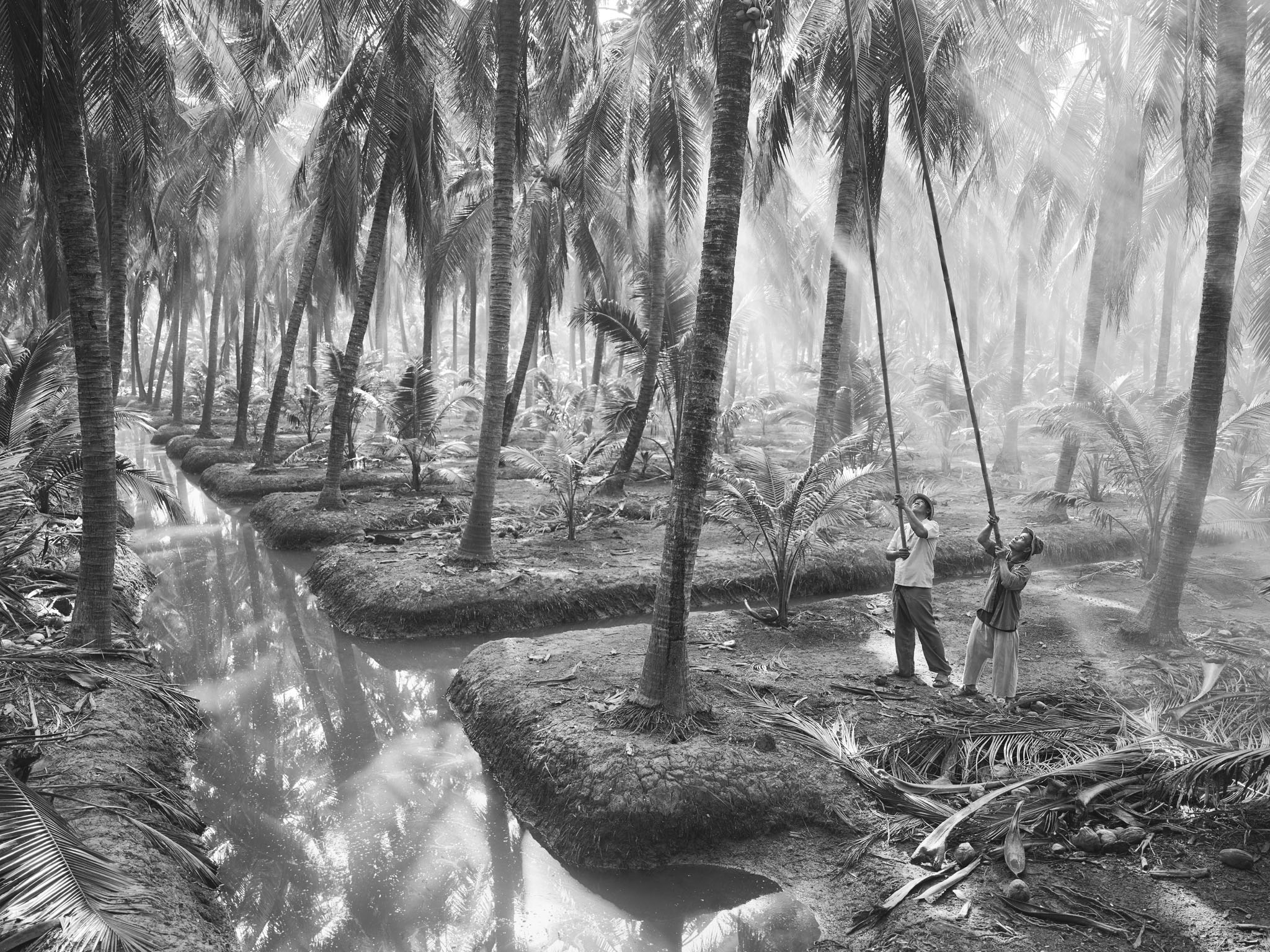
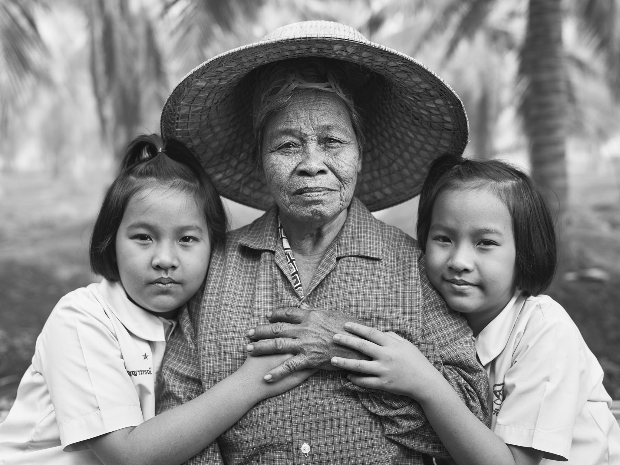
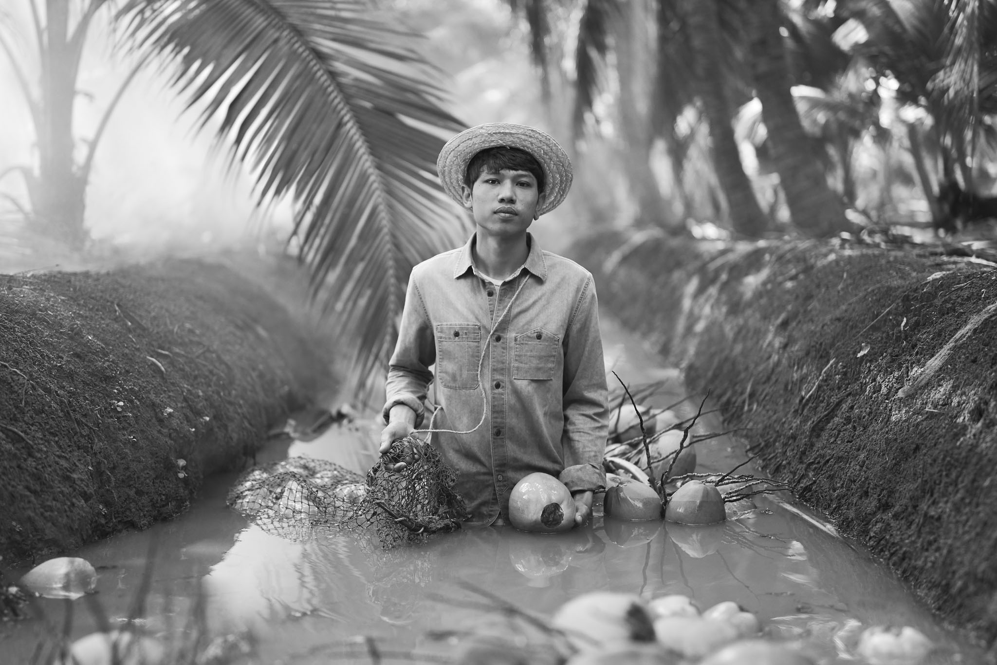
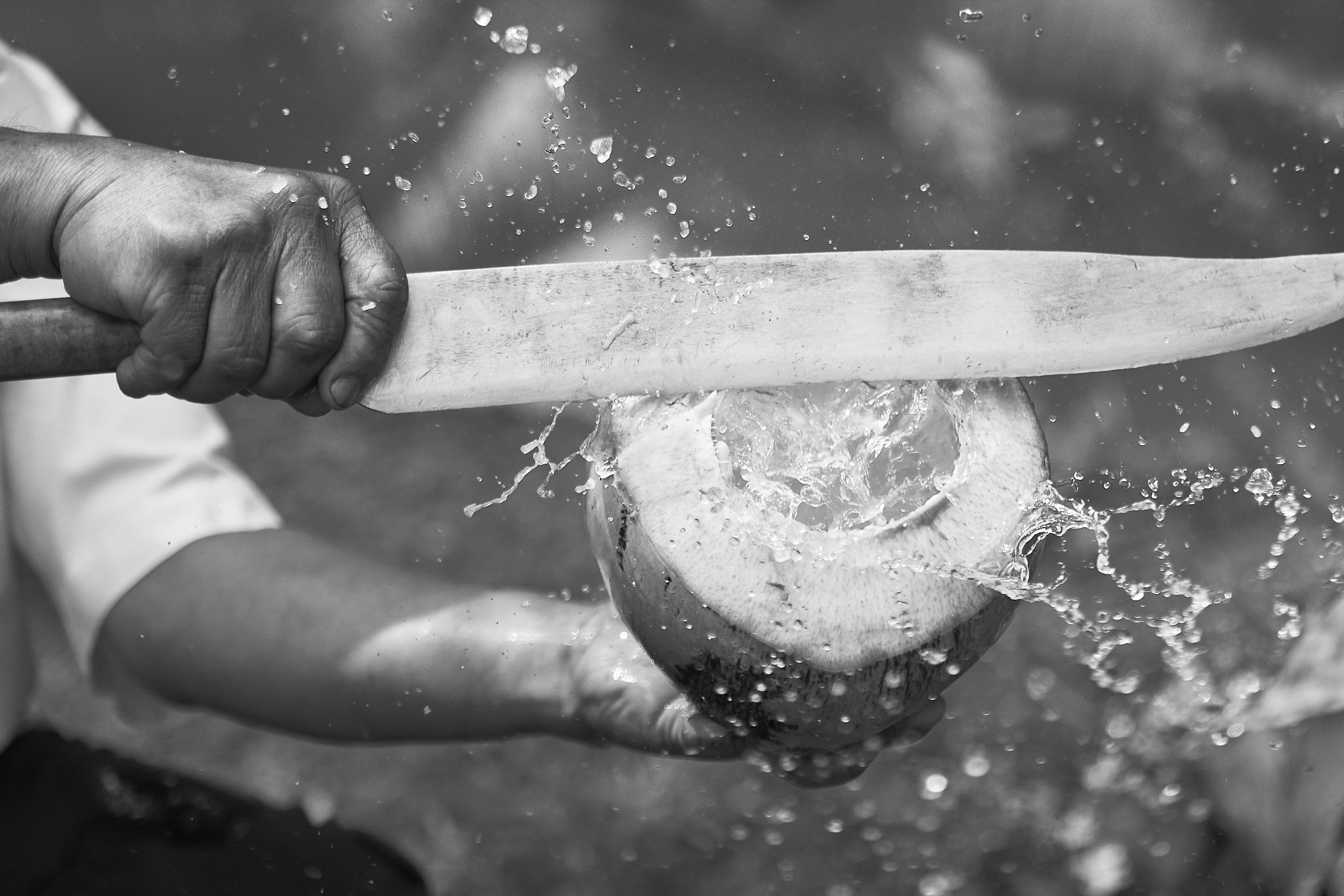
Harmless Harvest: Thailand
Wateraid: Tombo’s Wound
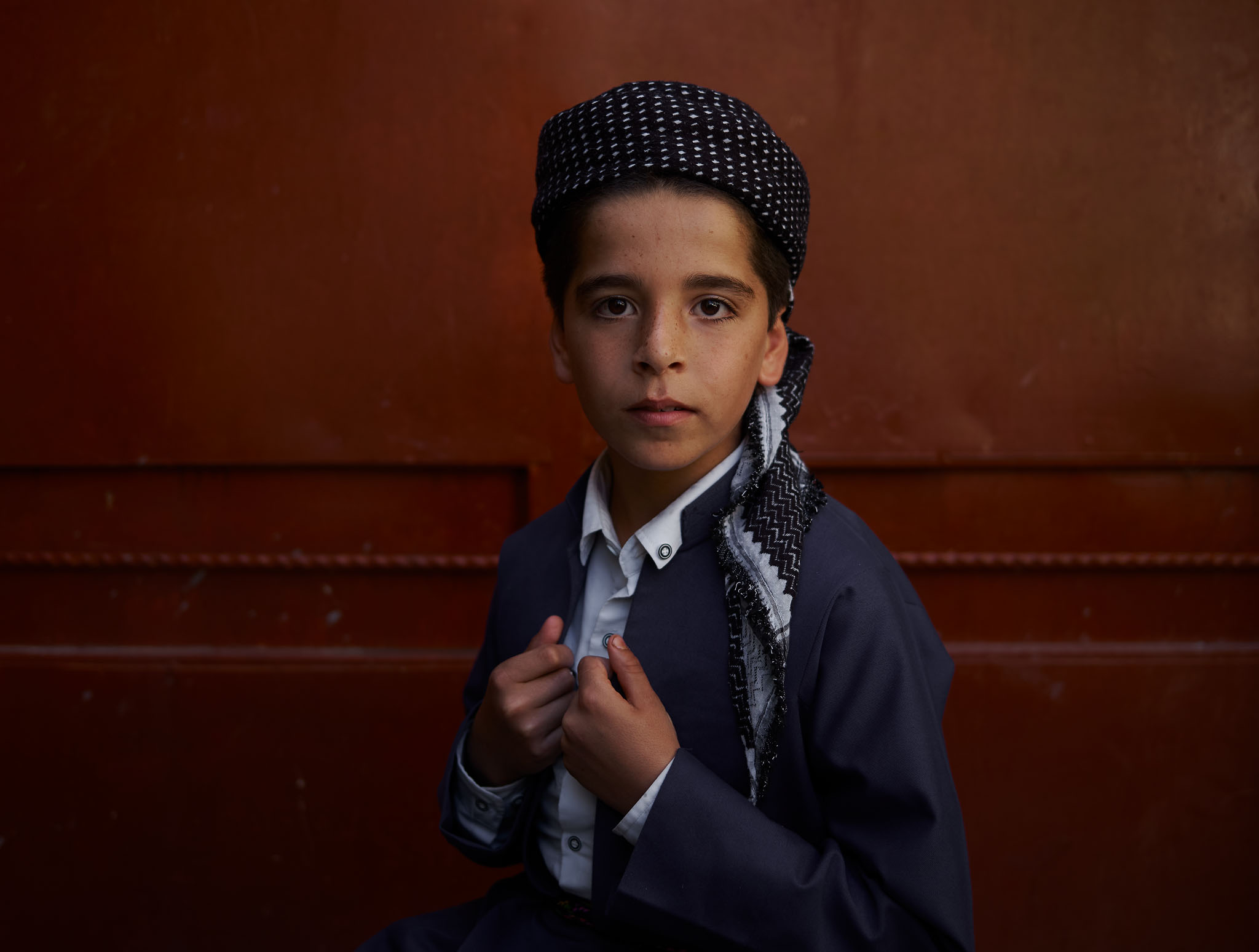
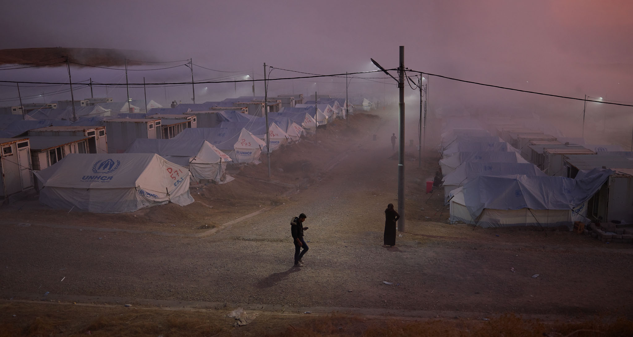
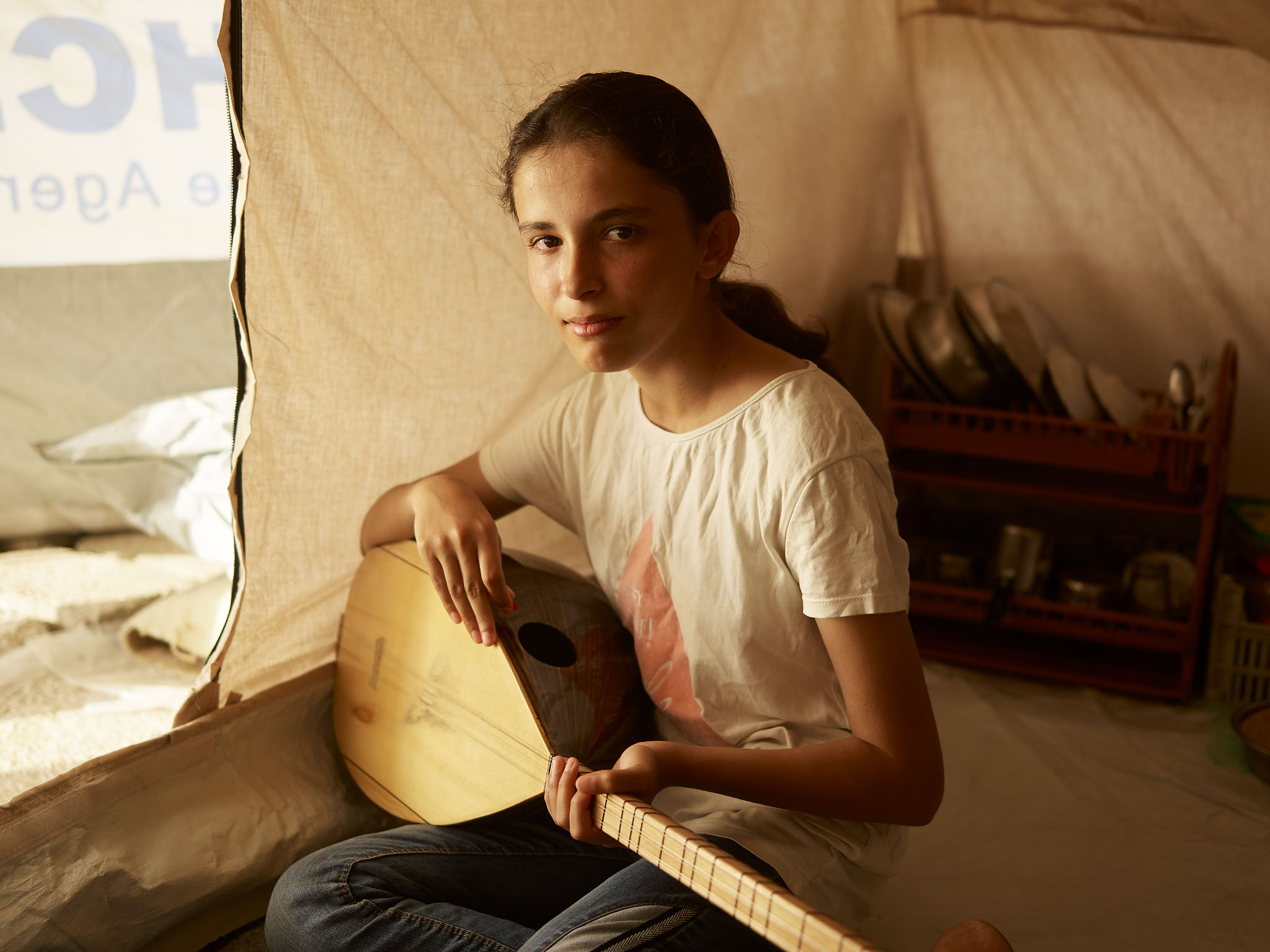
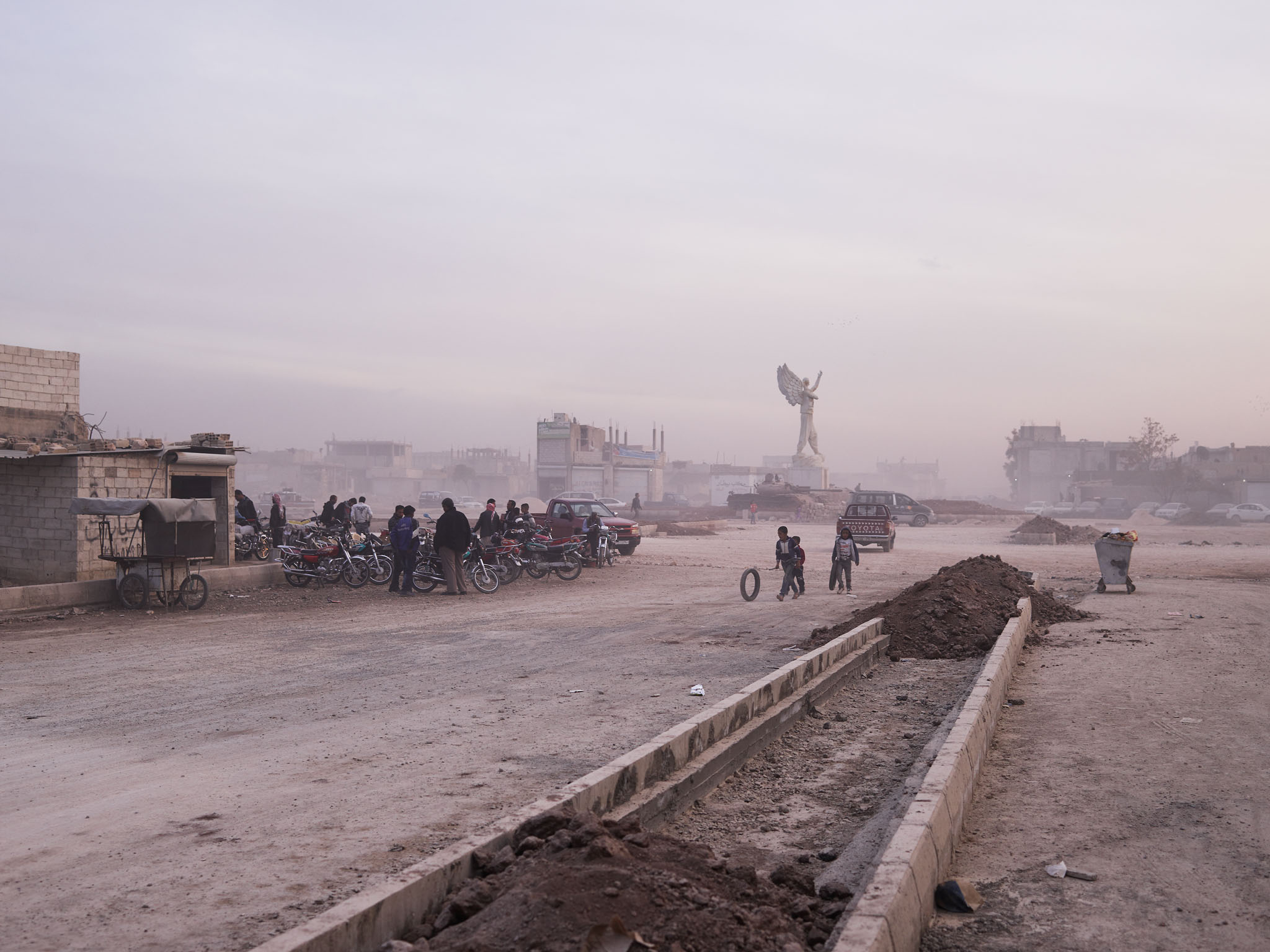
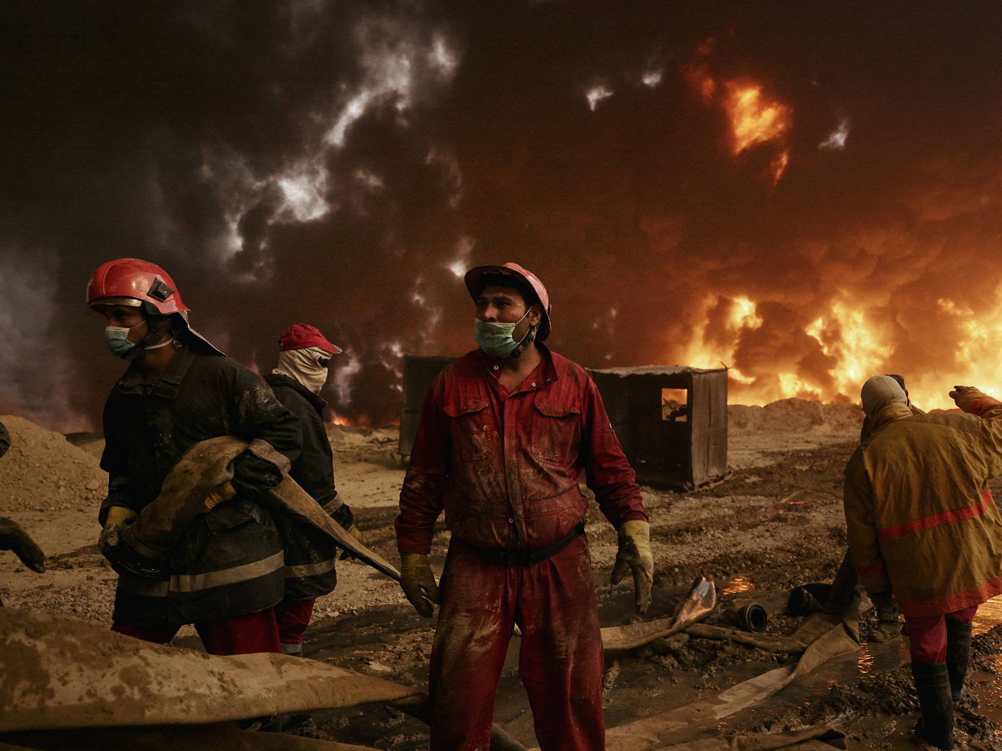
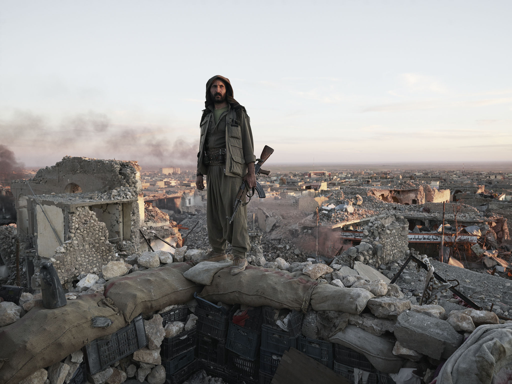
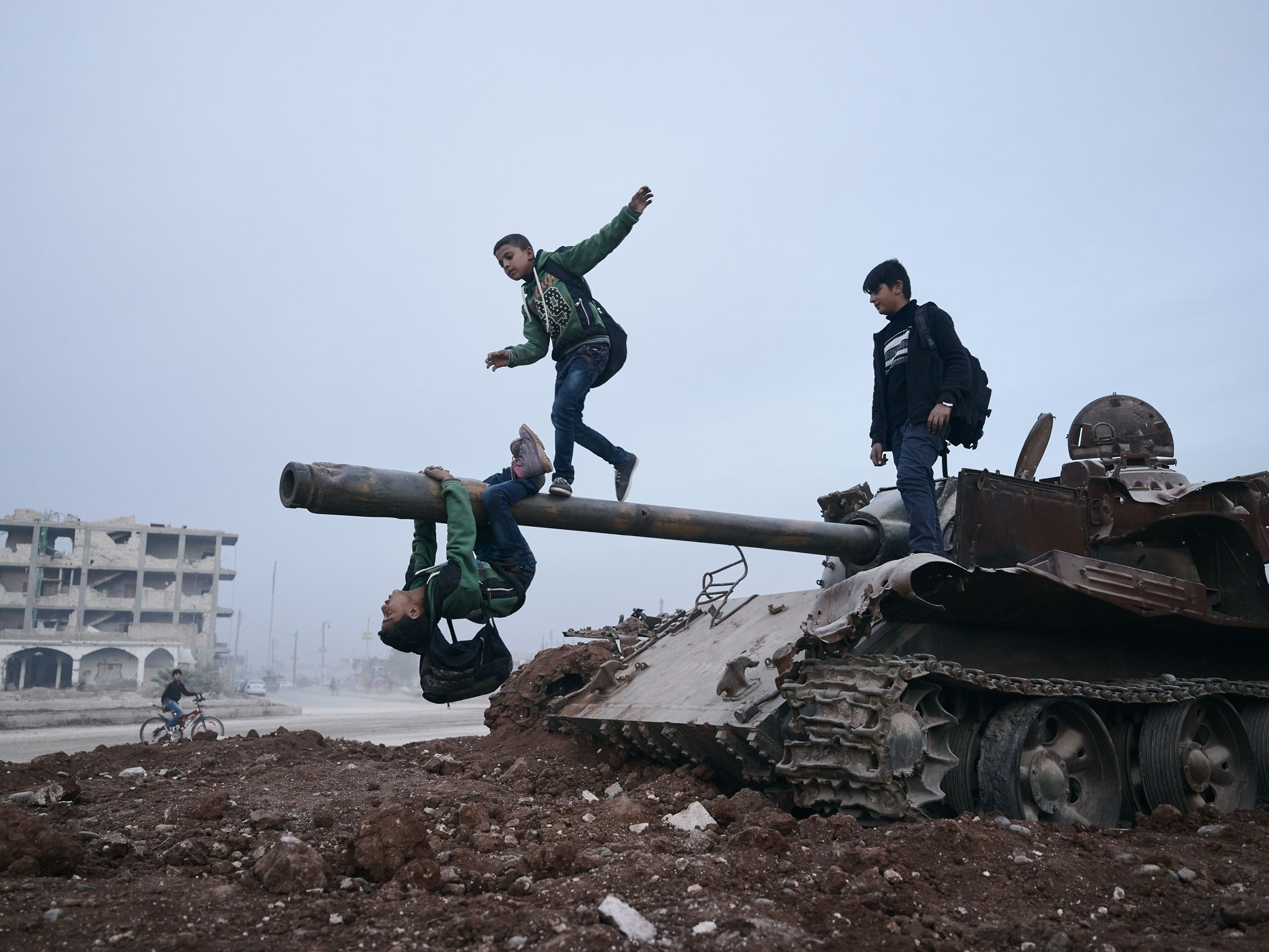
Oxfam: The Mosul Corridor
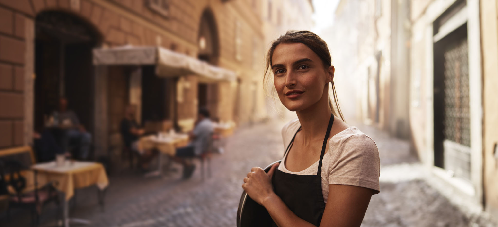
Lavazza Calendar 2016
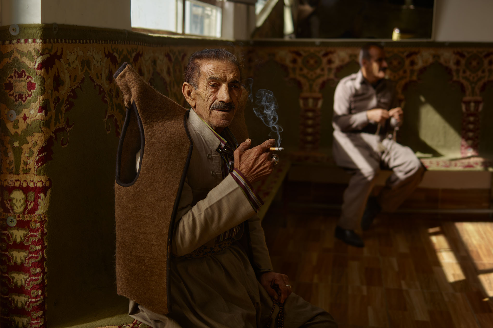
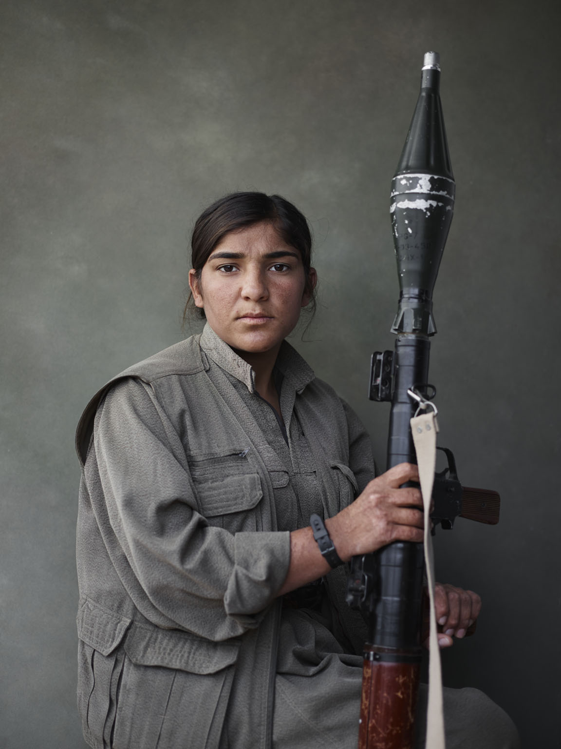
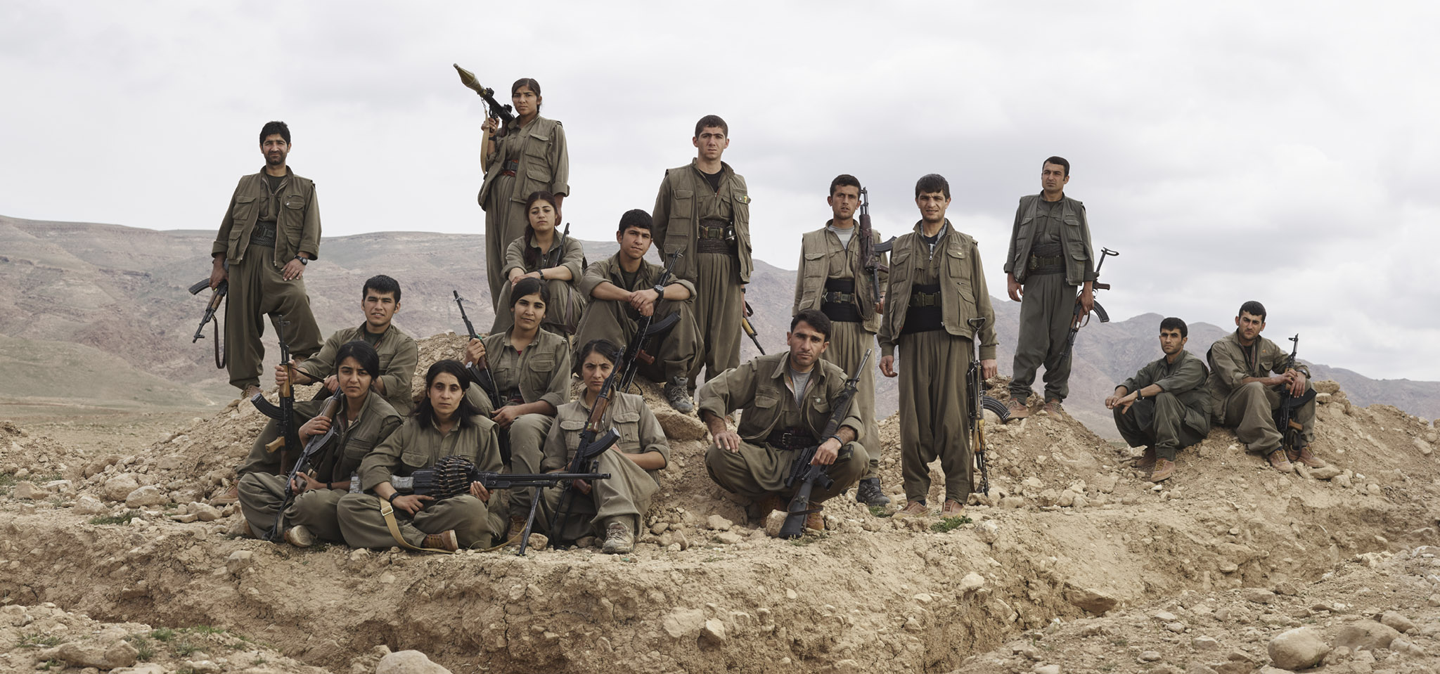
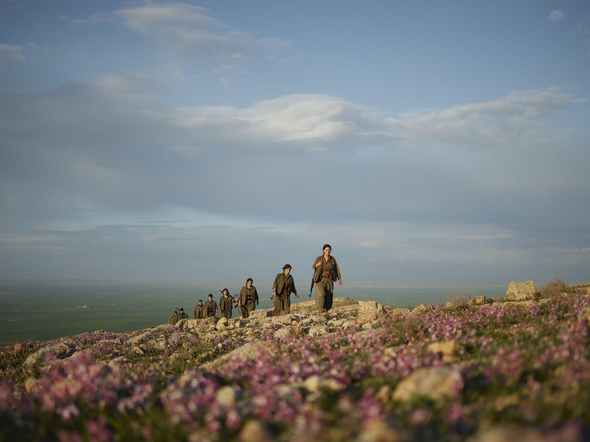
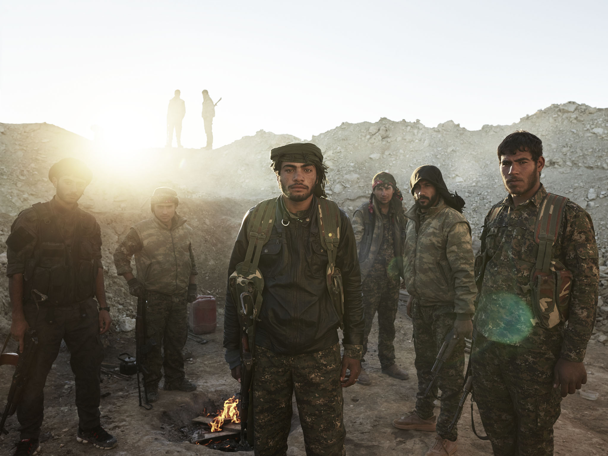
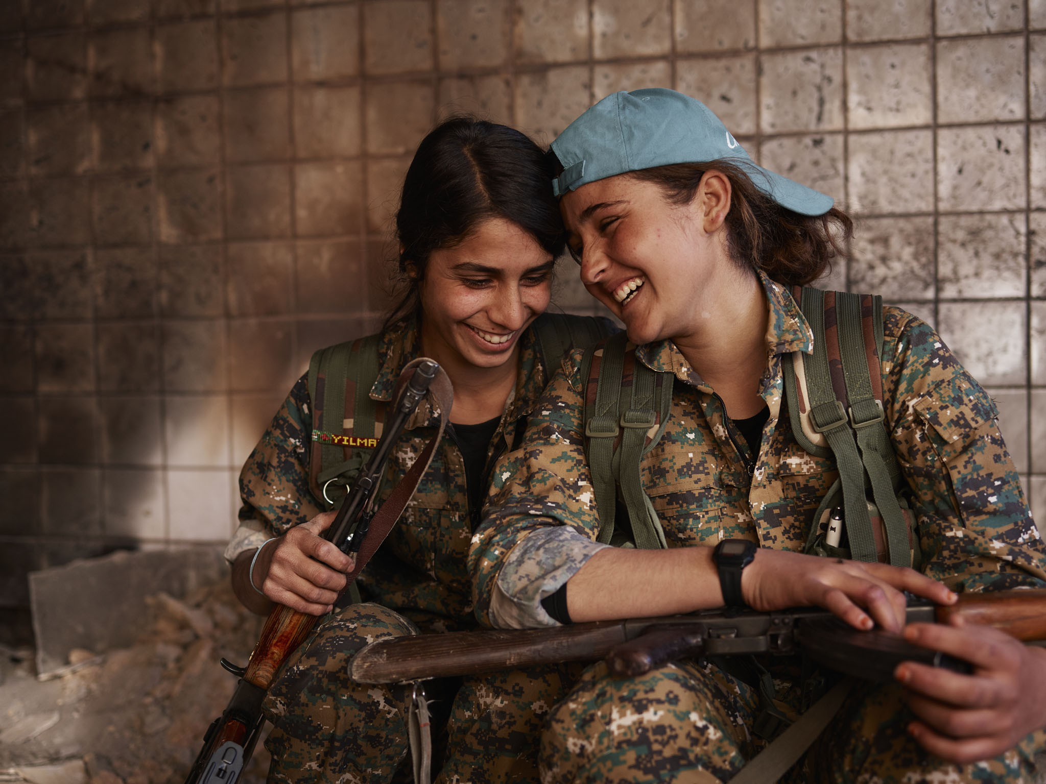
Guerrilla Fighters of Kurdistan
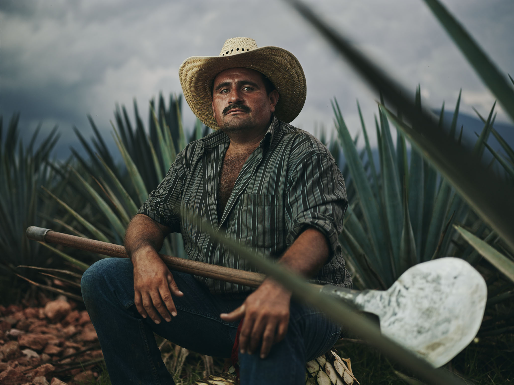
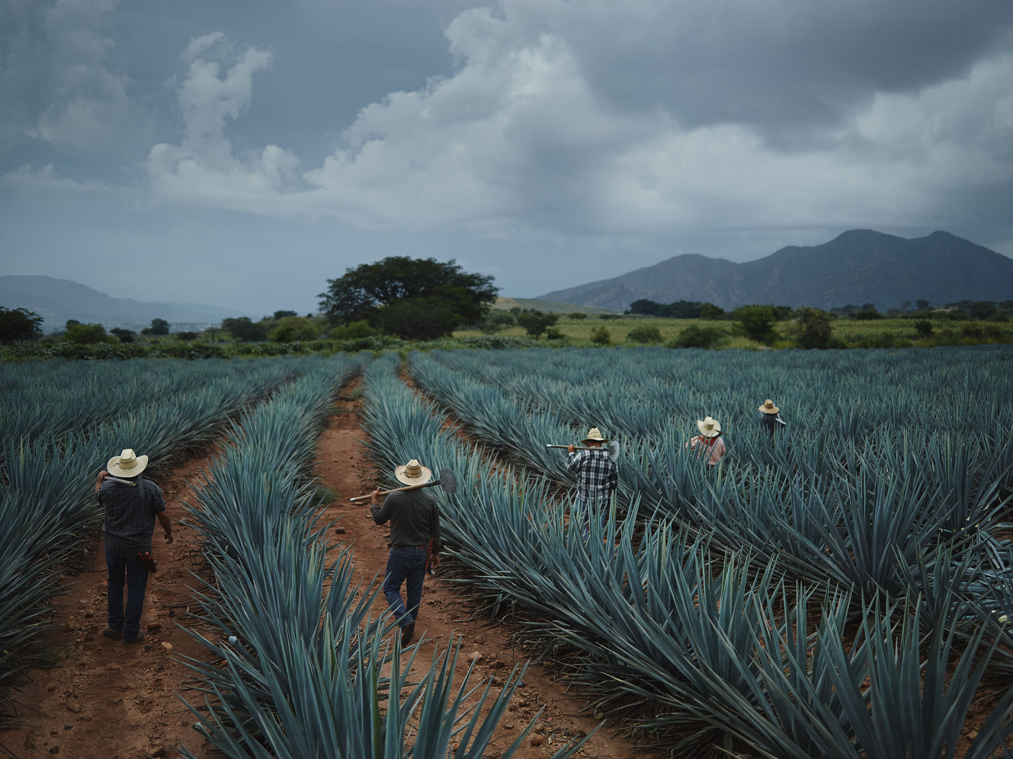
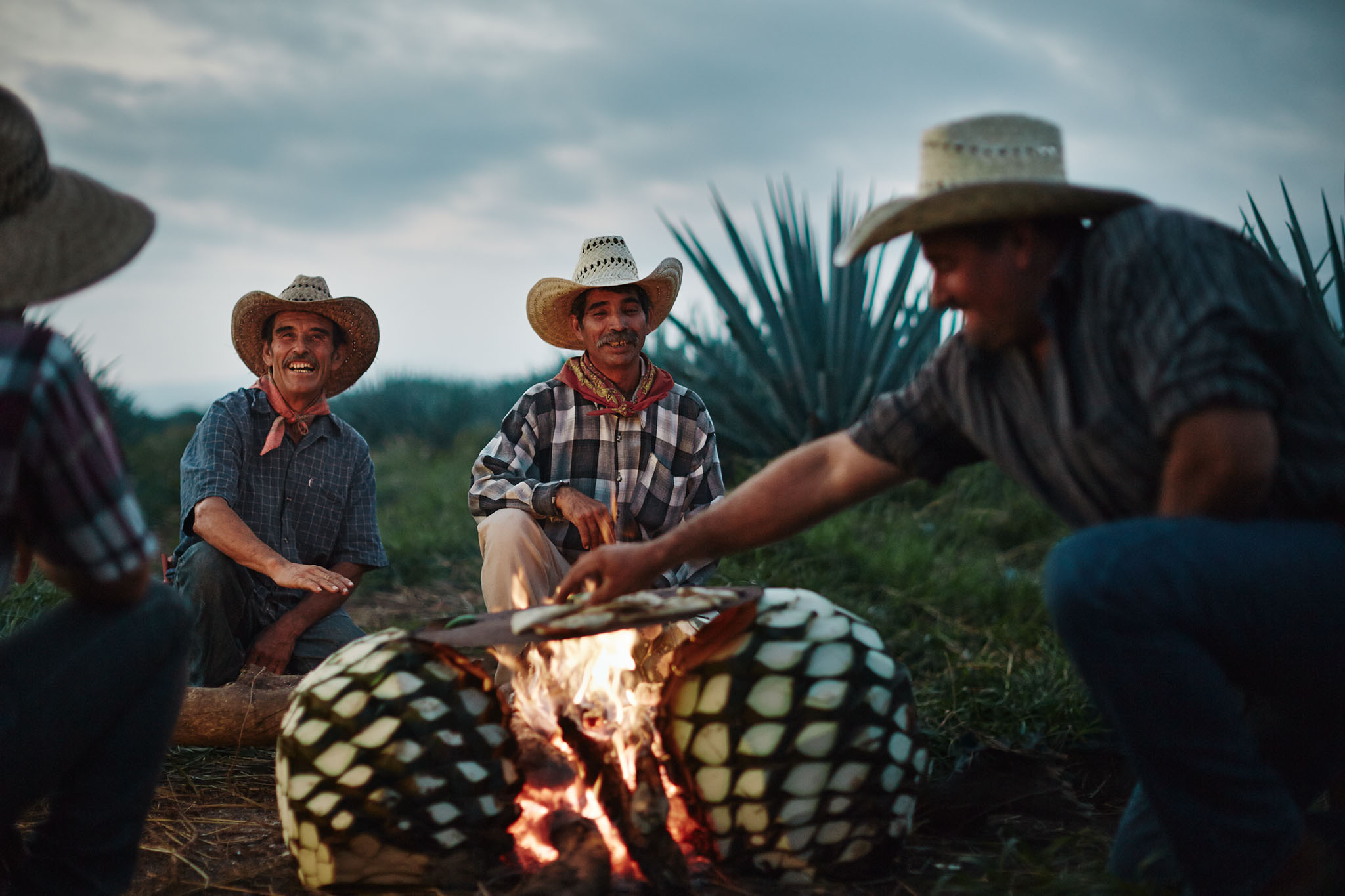
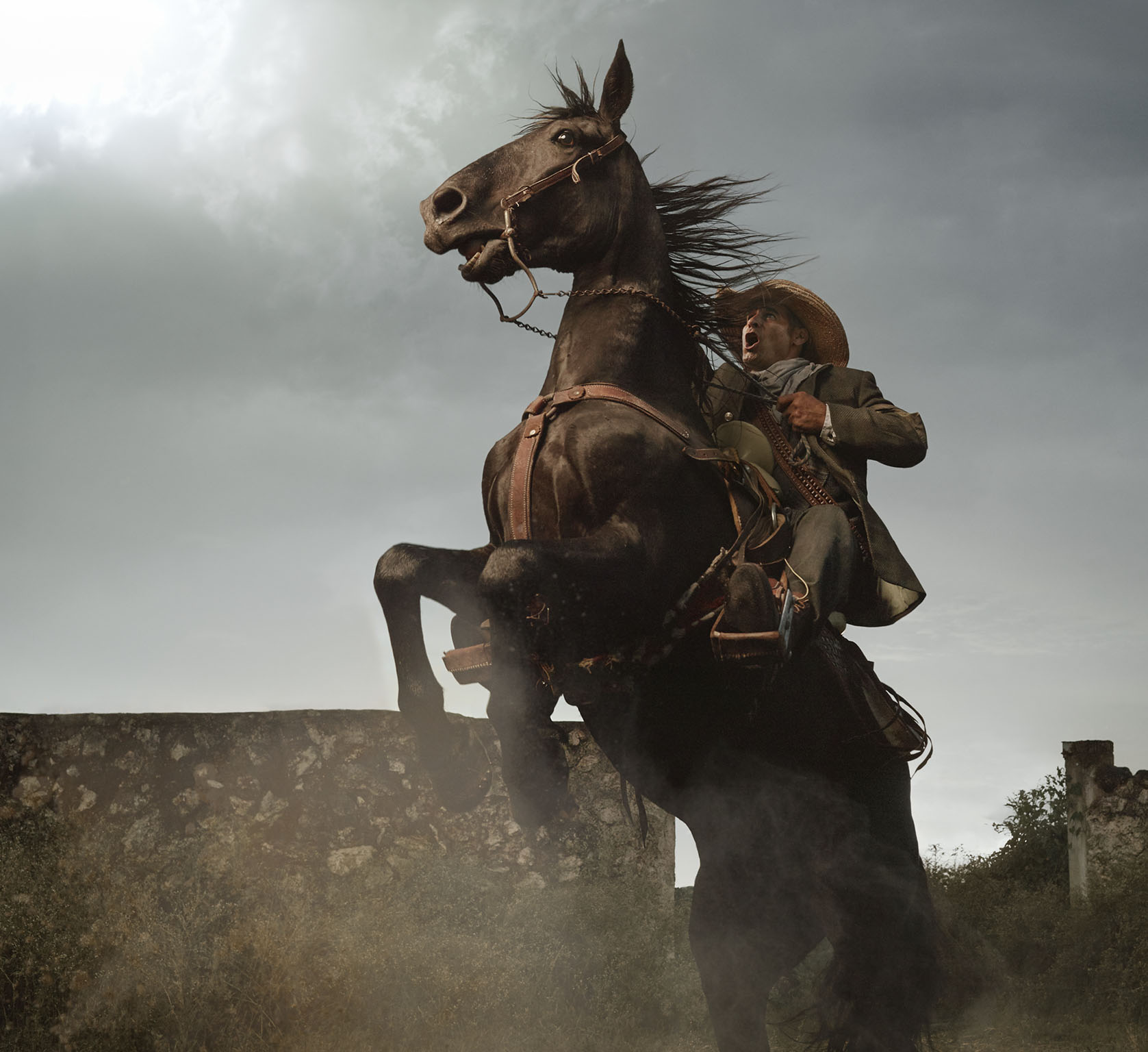
Jose Cuervo: Ad Campaign
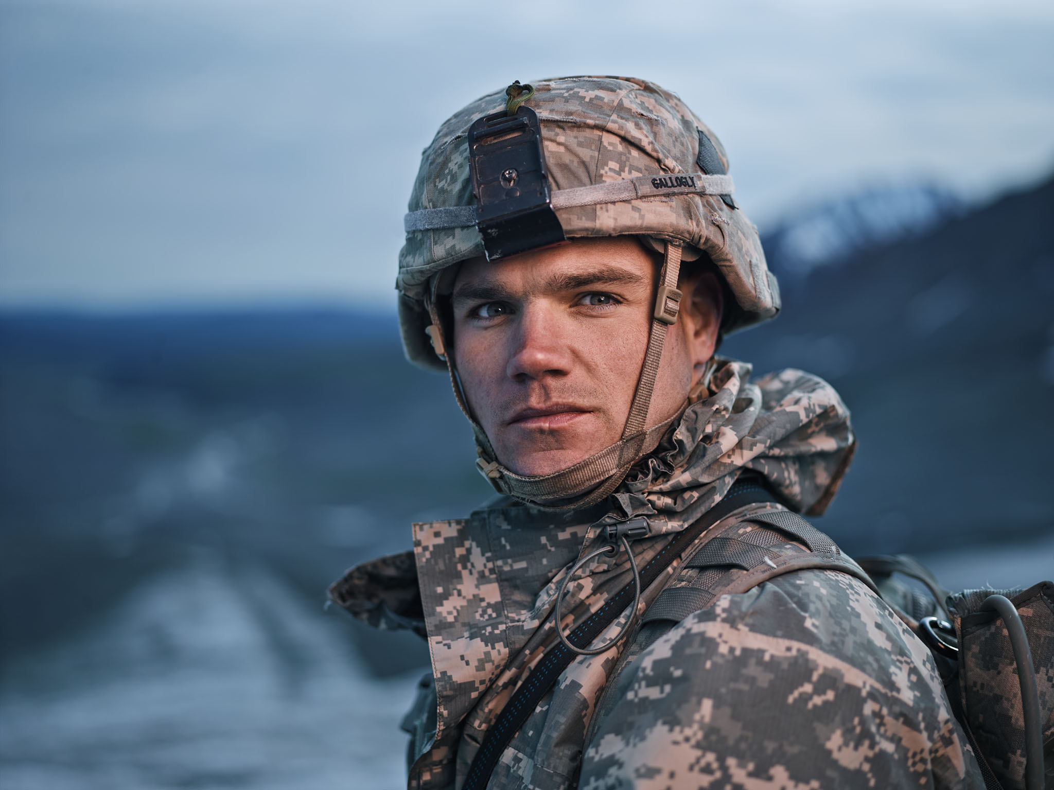
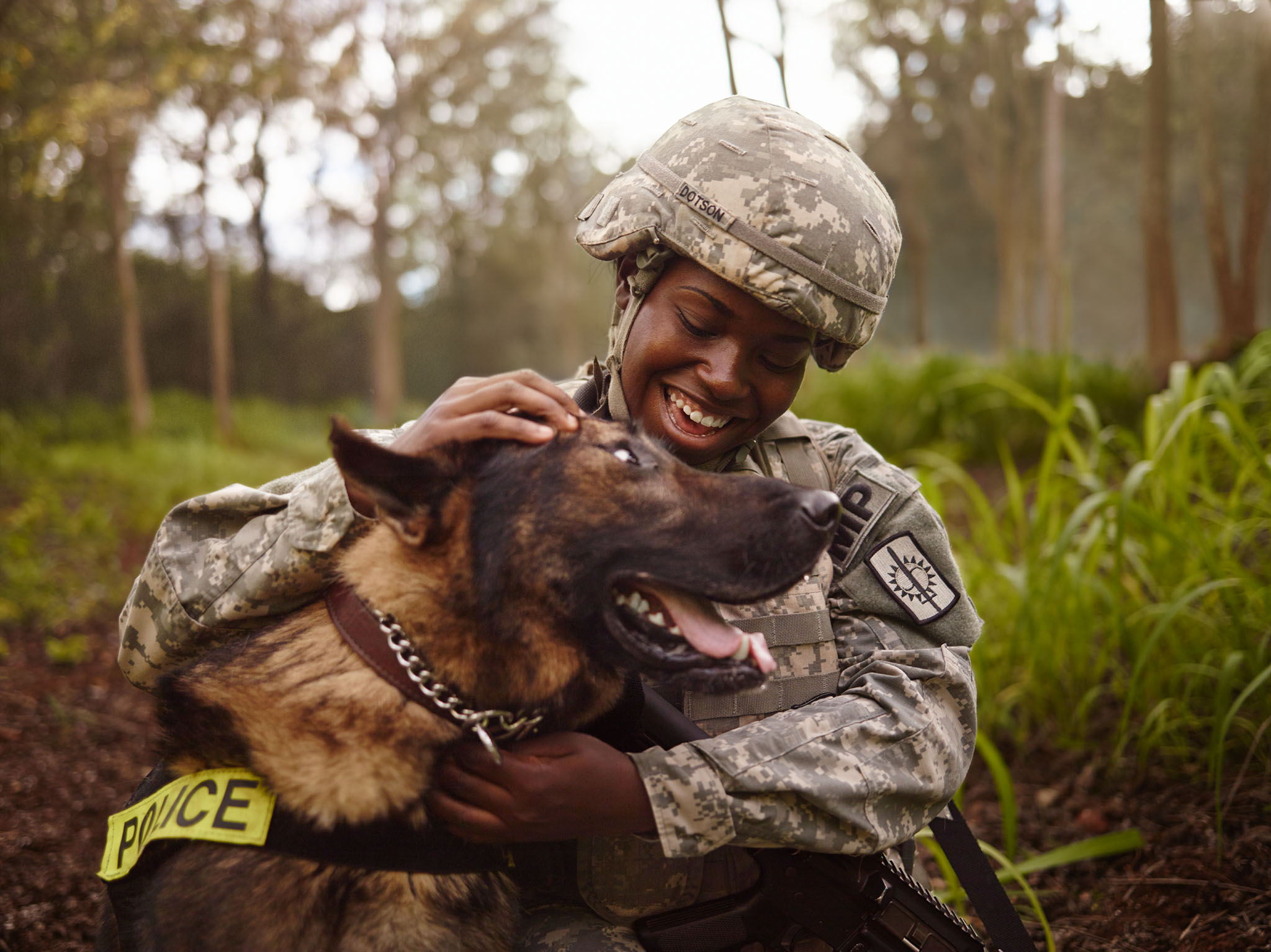
US Army: Ad Campaign
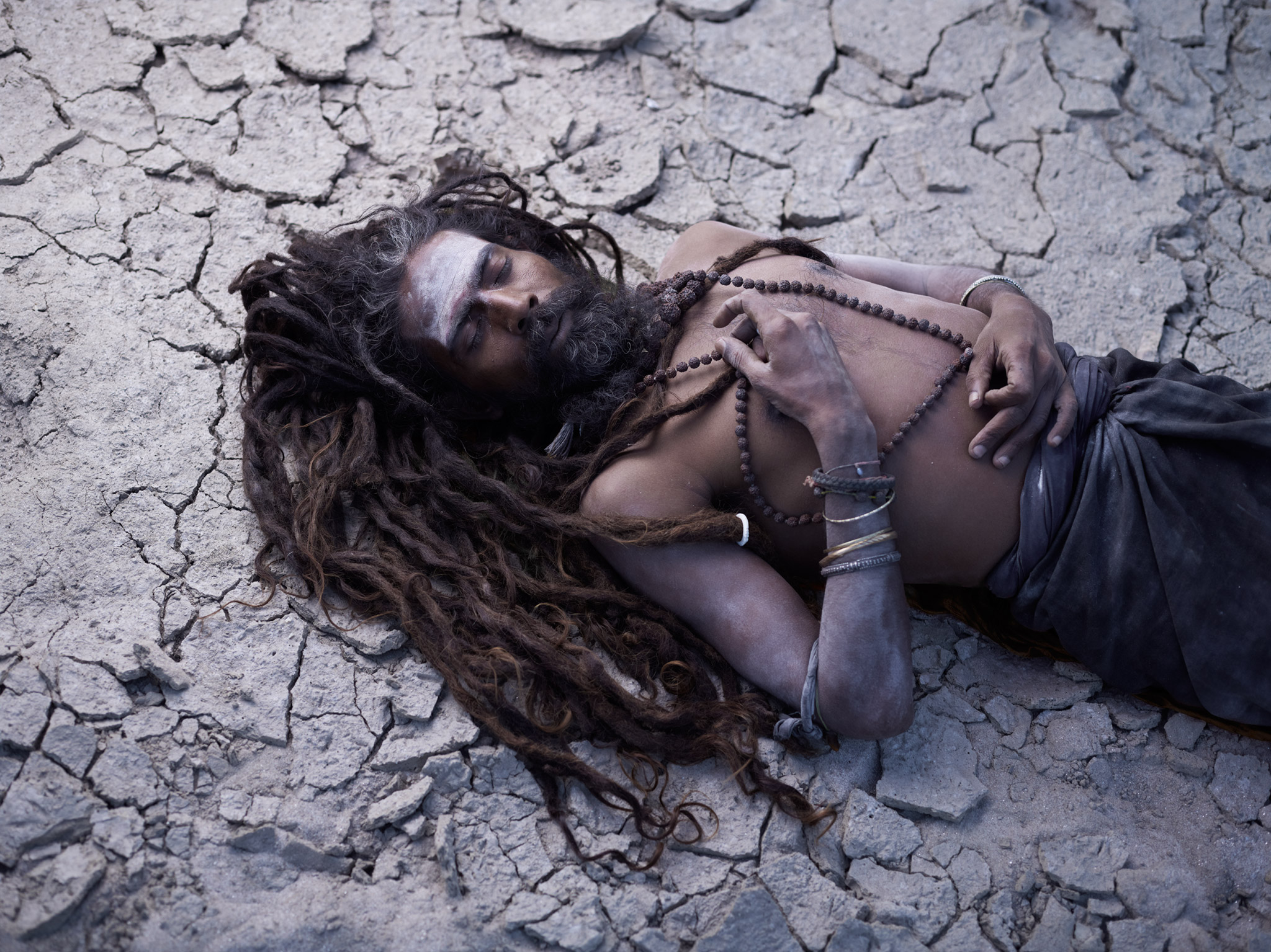
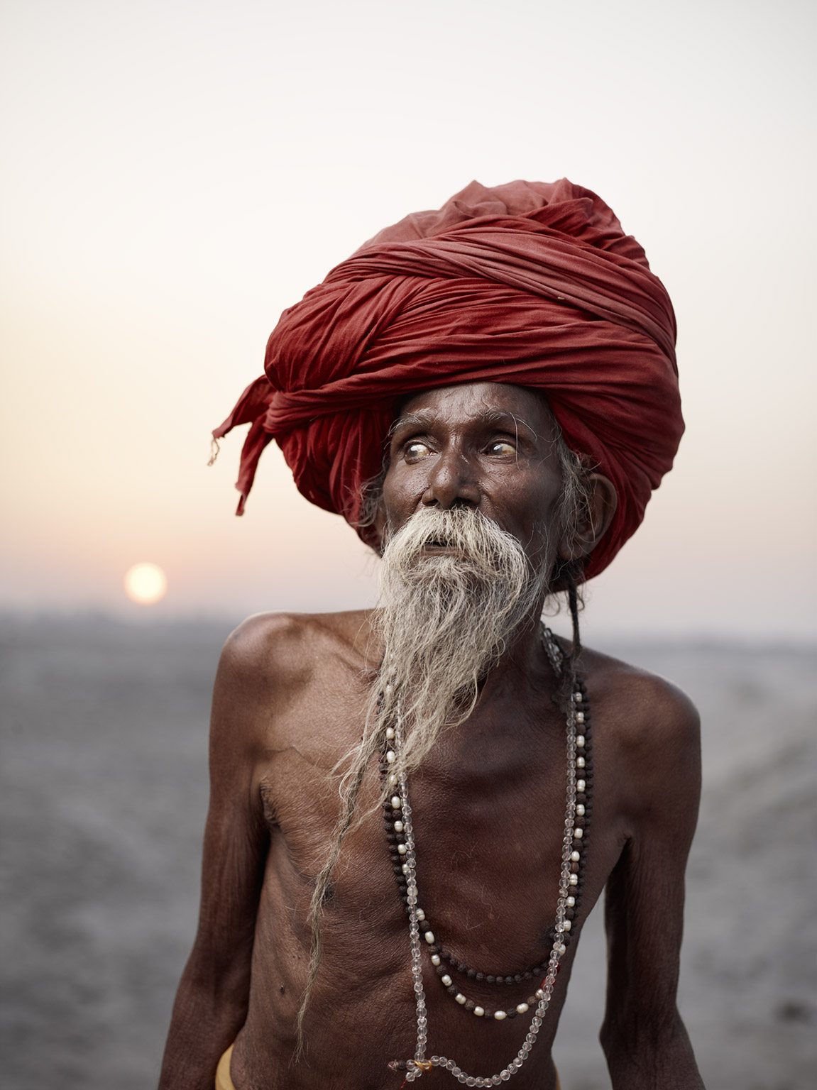
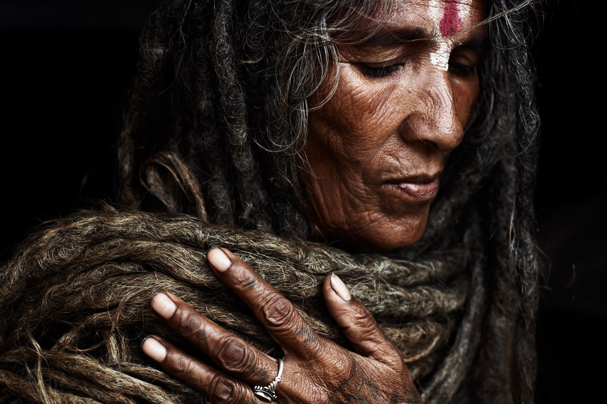
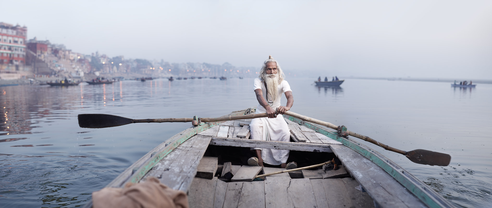
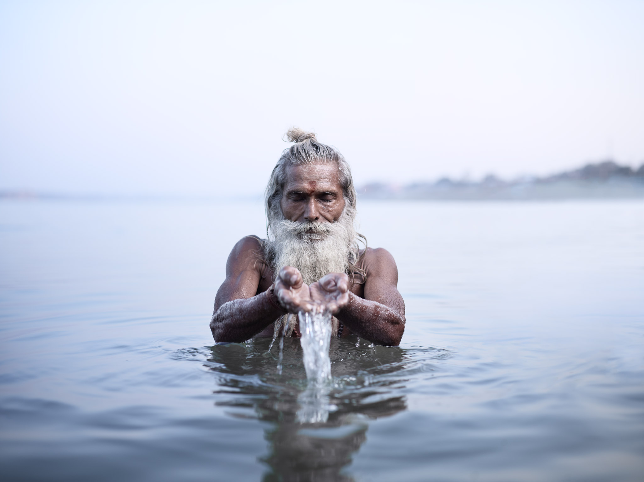
Holy Men
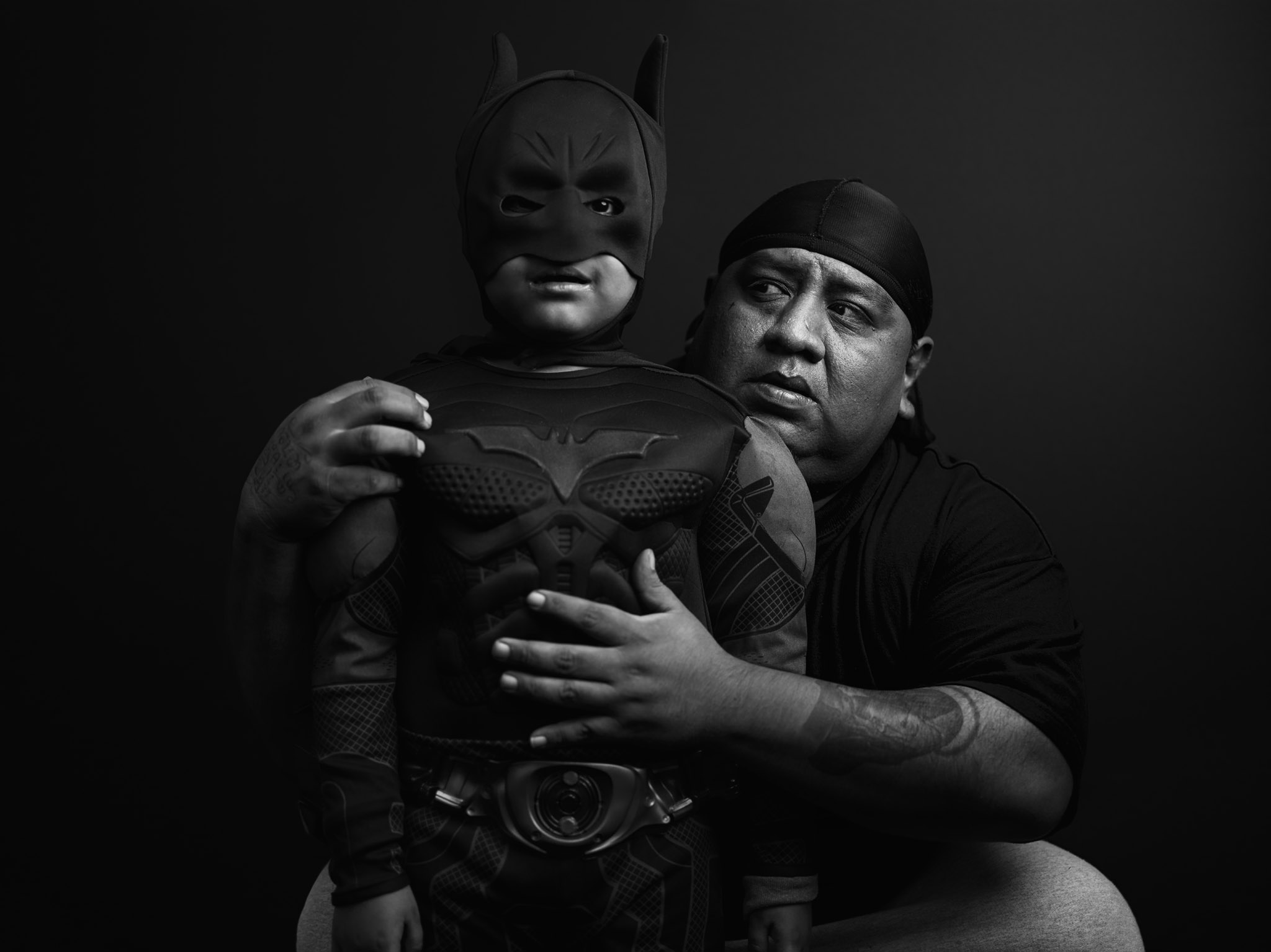
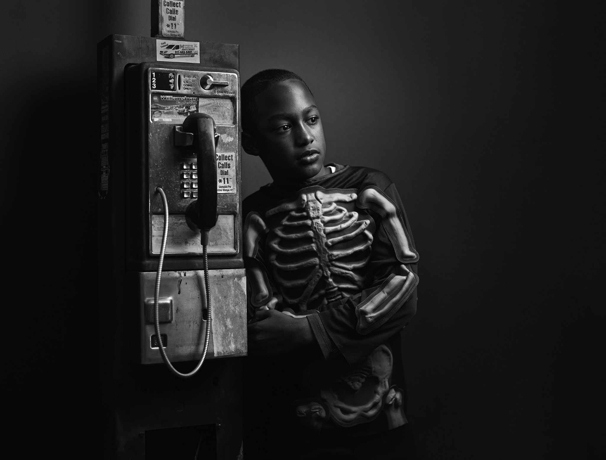
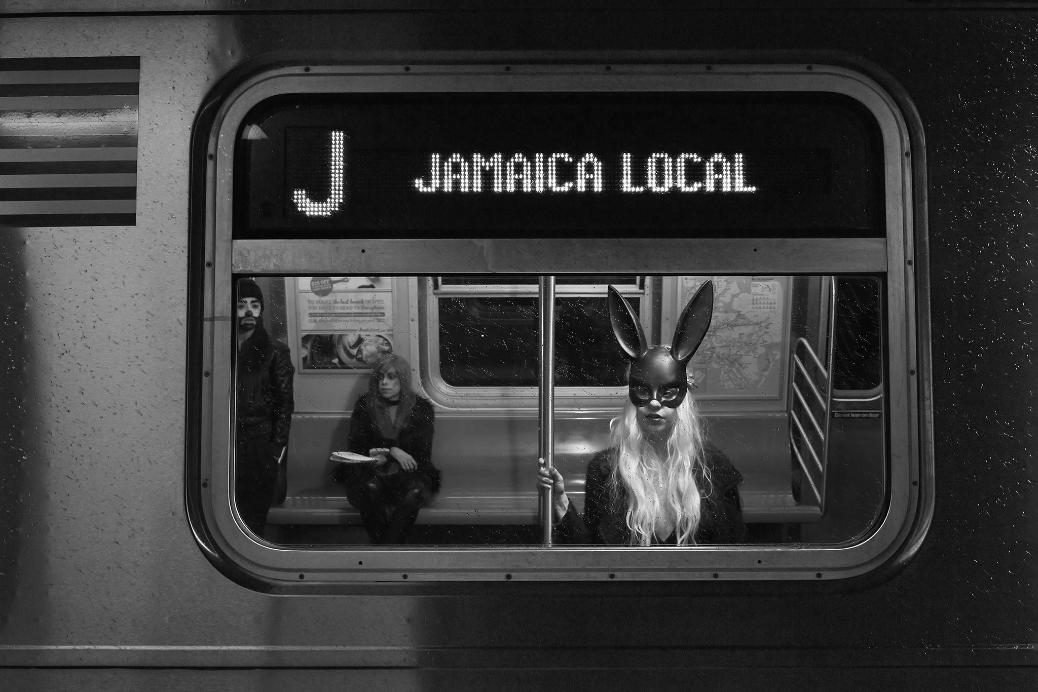
Halloween In Brooklyn
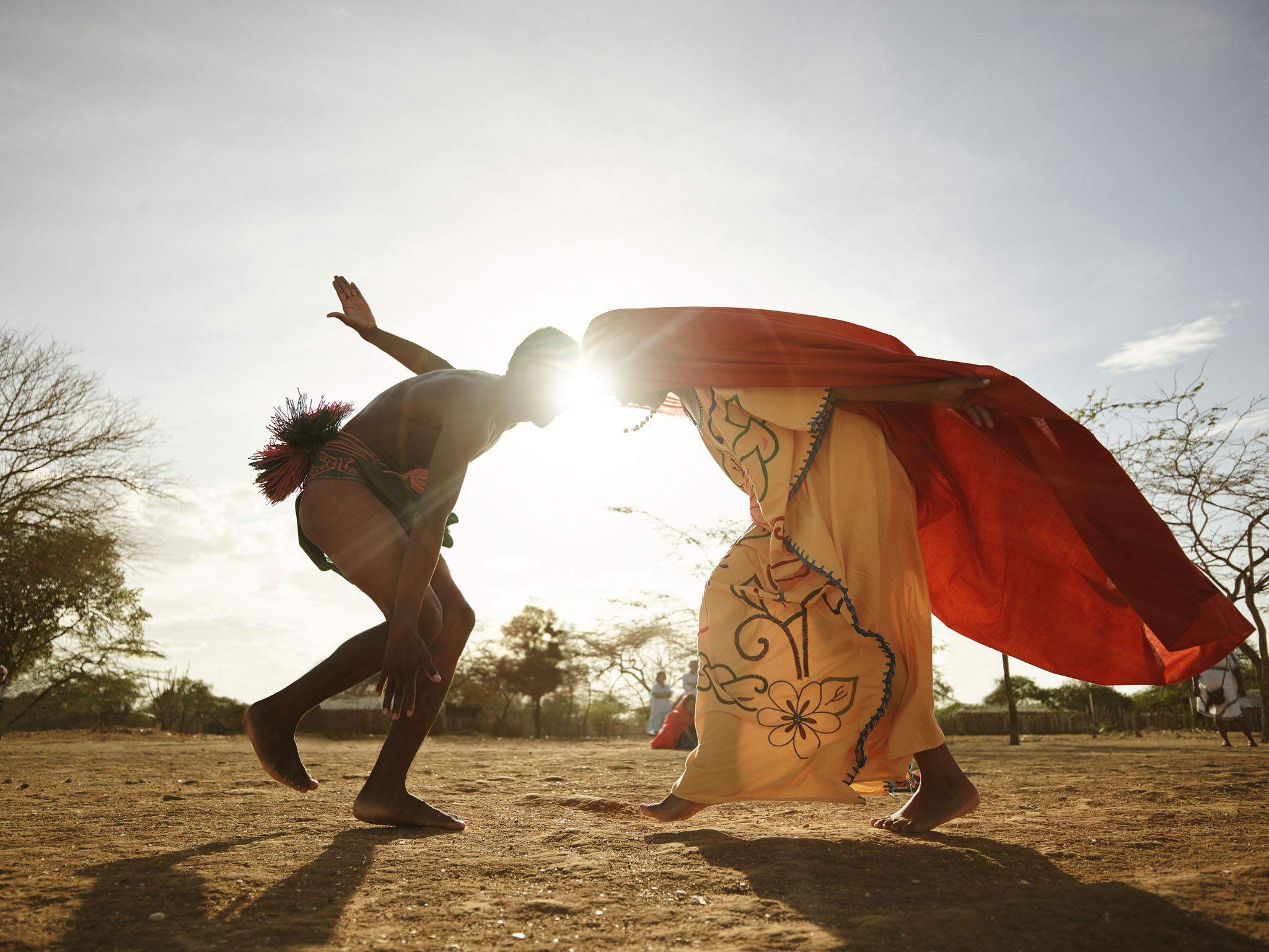
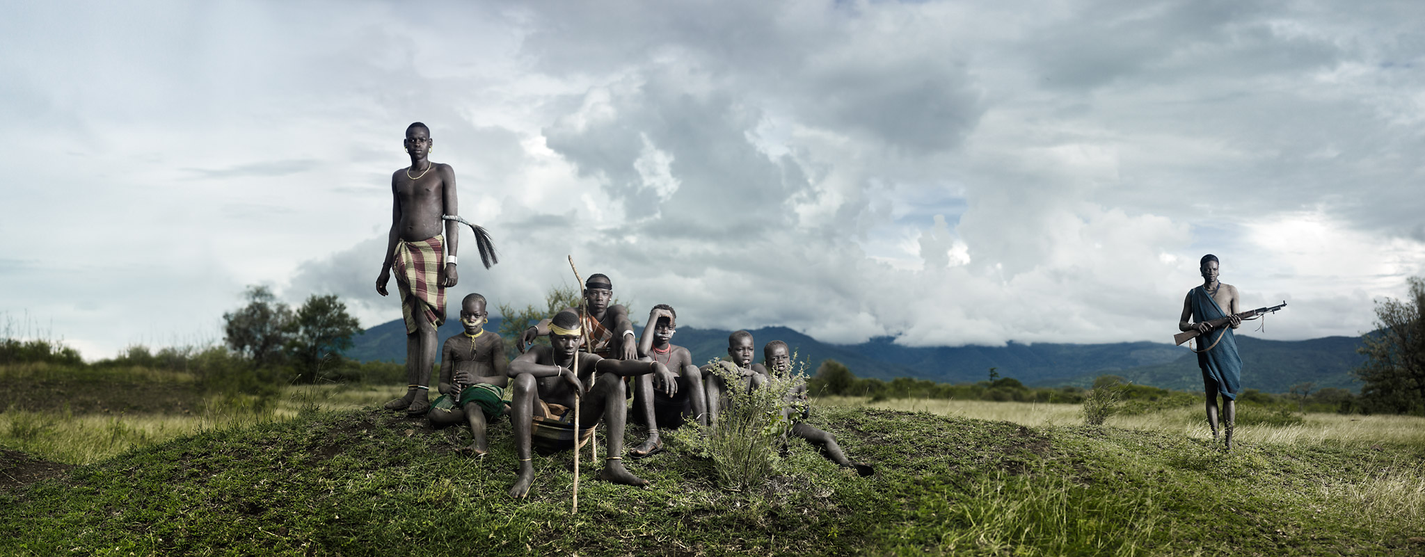
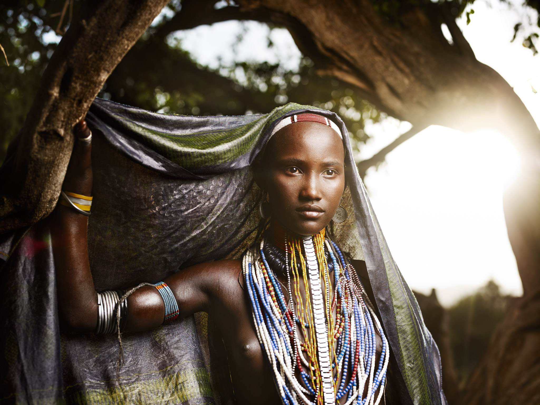
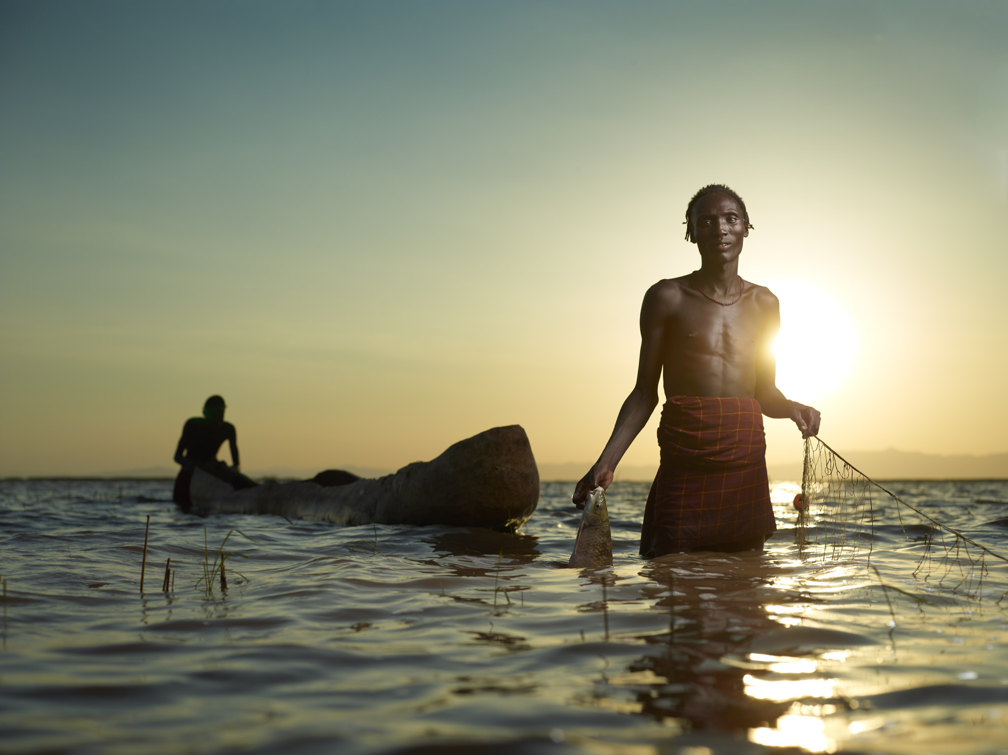
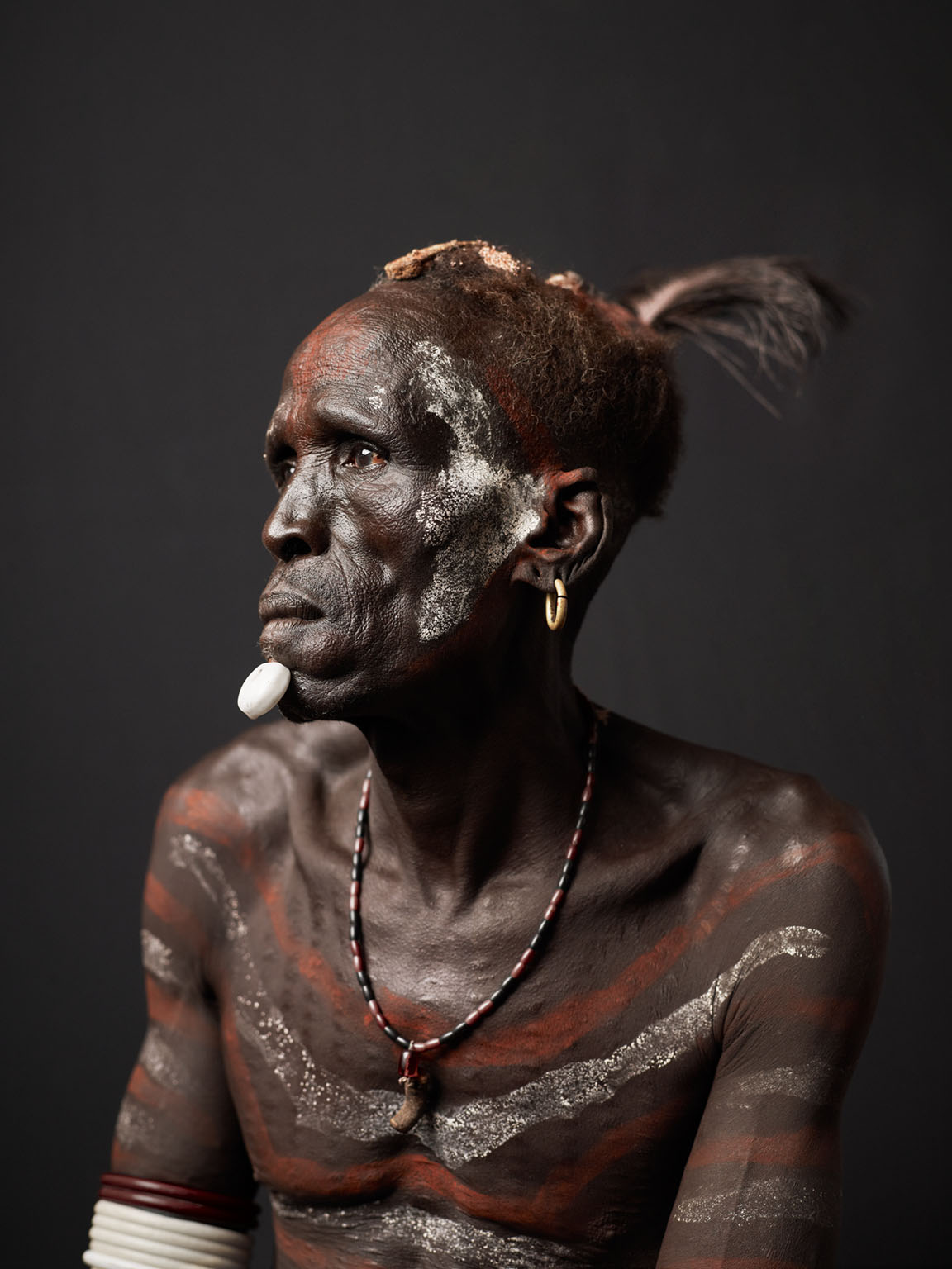
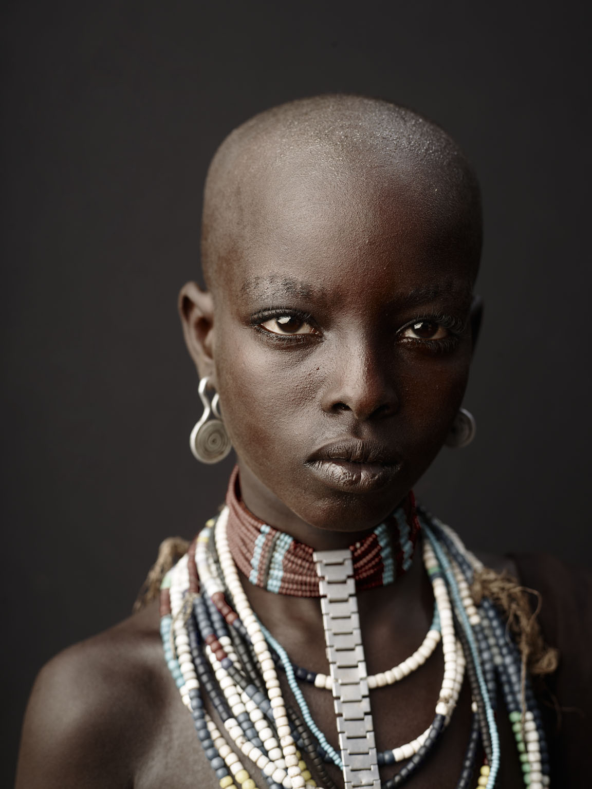
The Omo Valley
The Mentawai
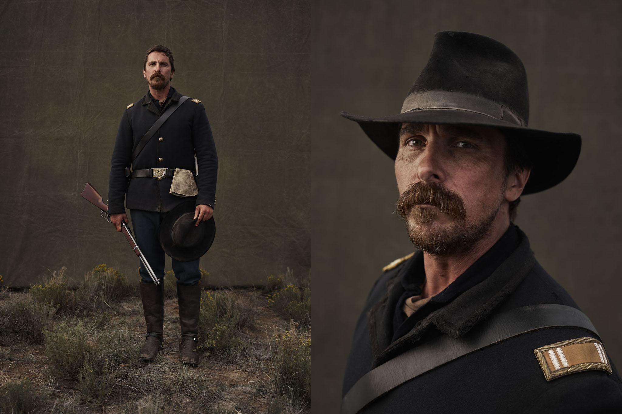
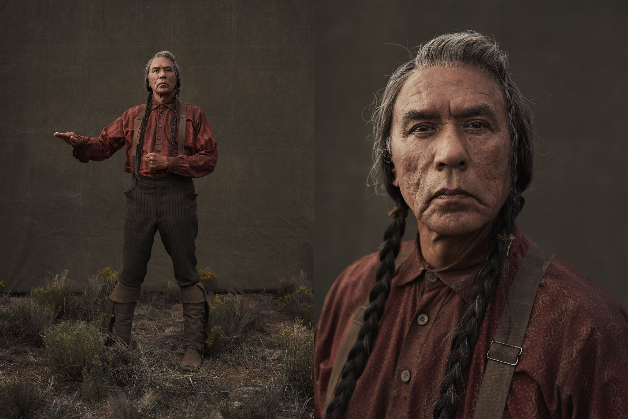
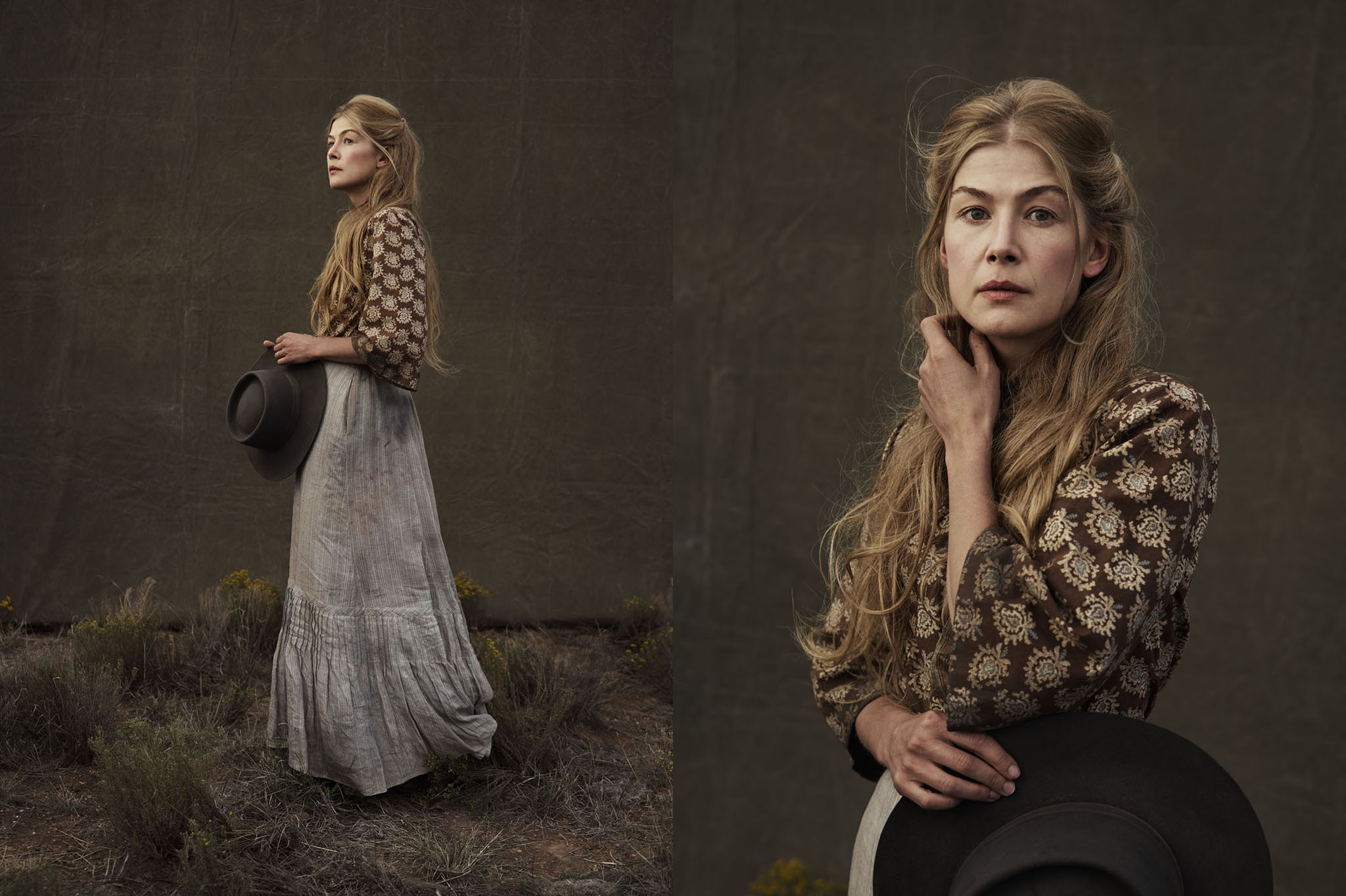
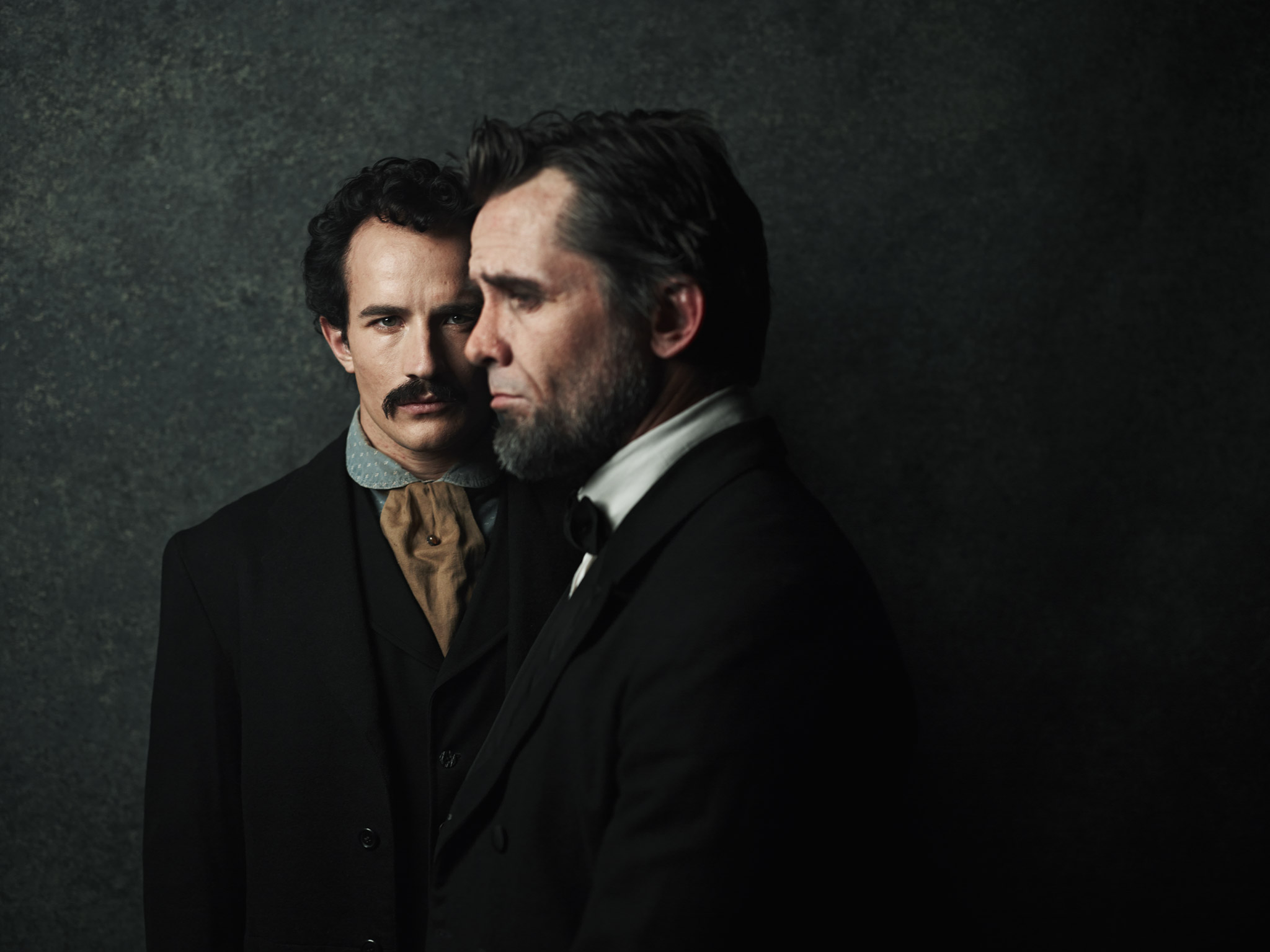
Killing Kennedy & Lincoln
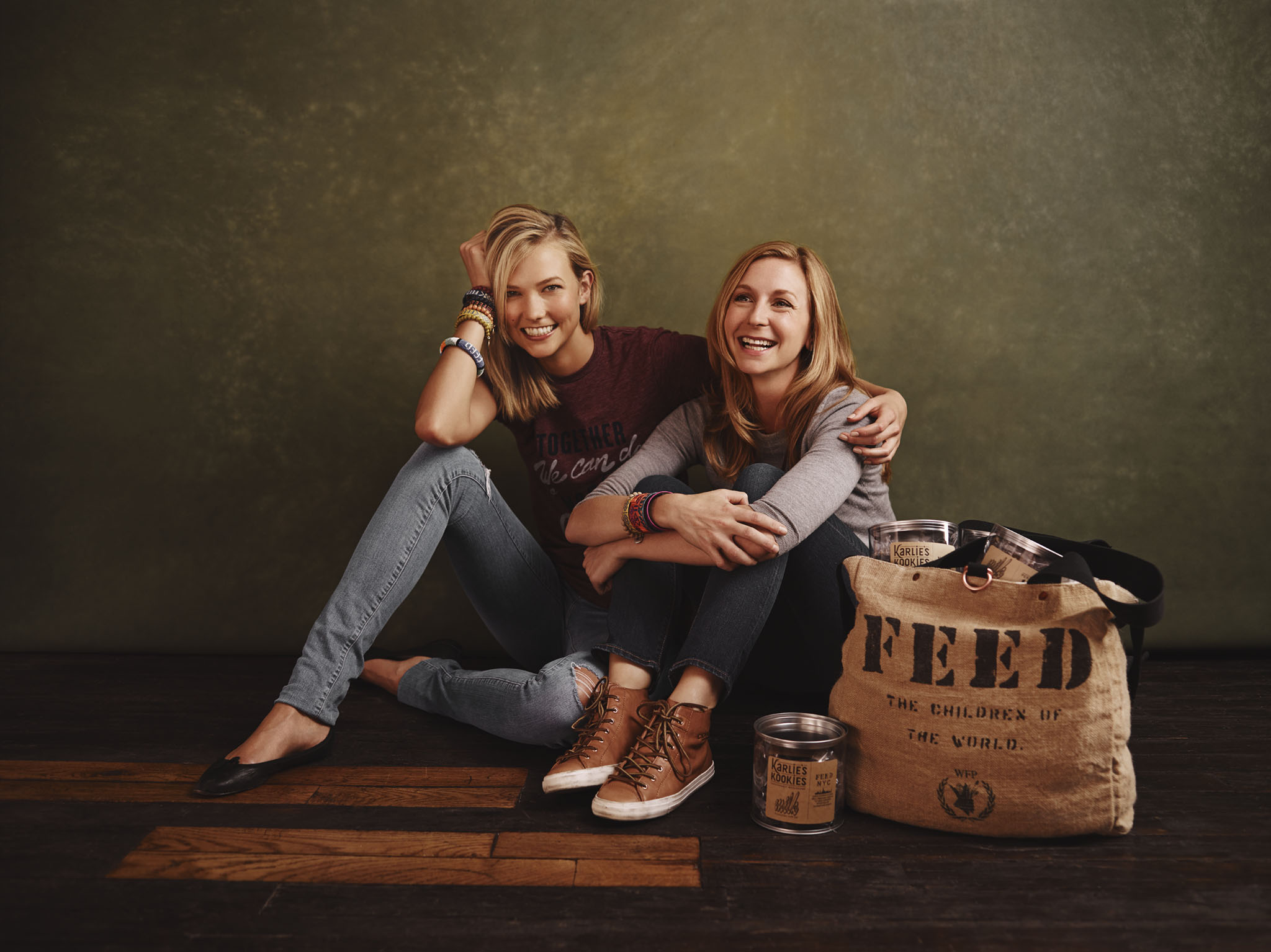
FEED Projects
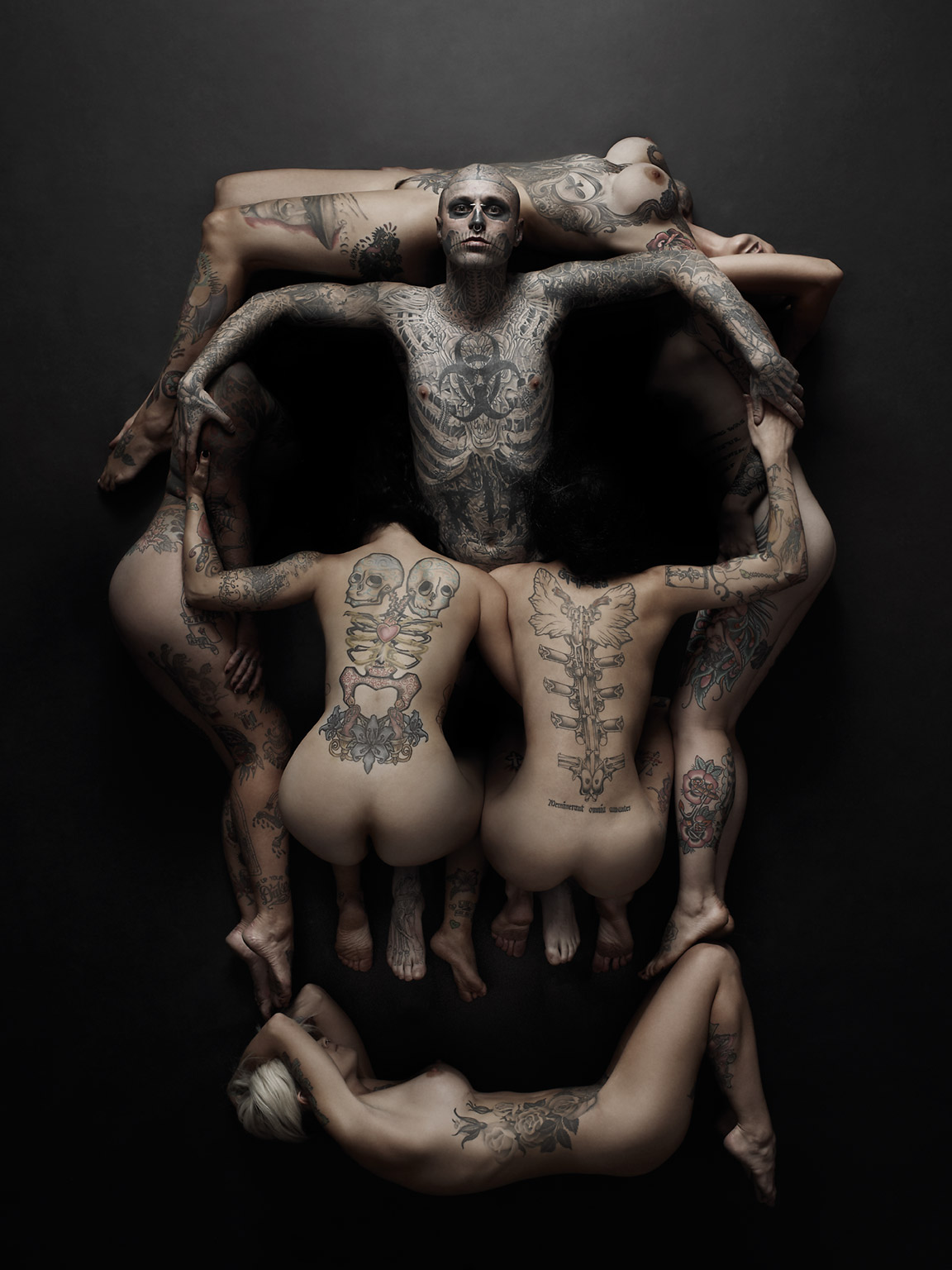
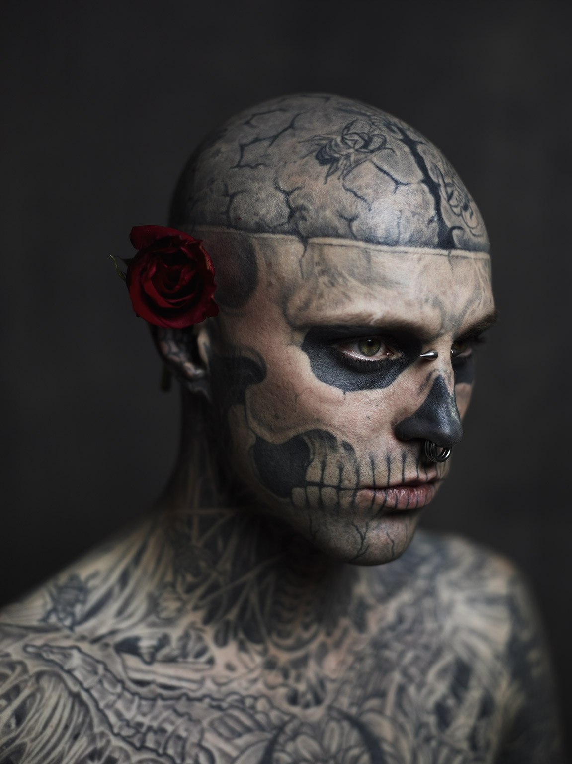
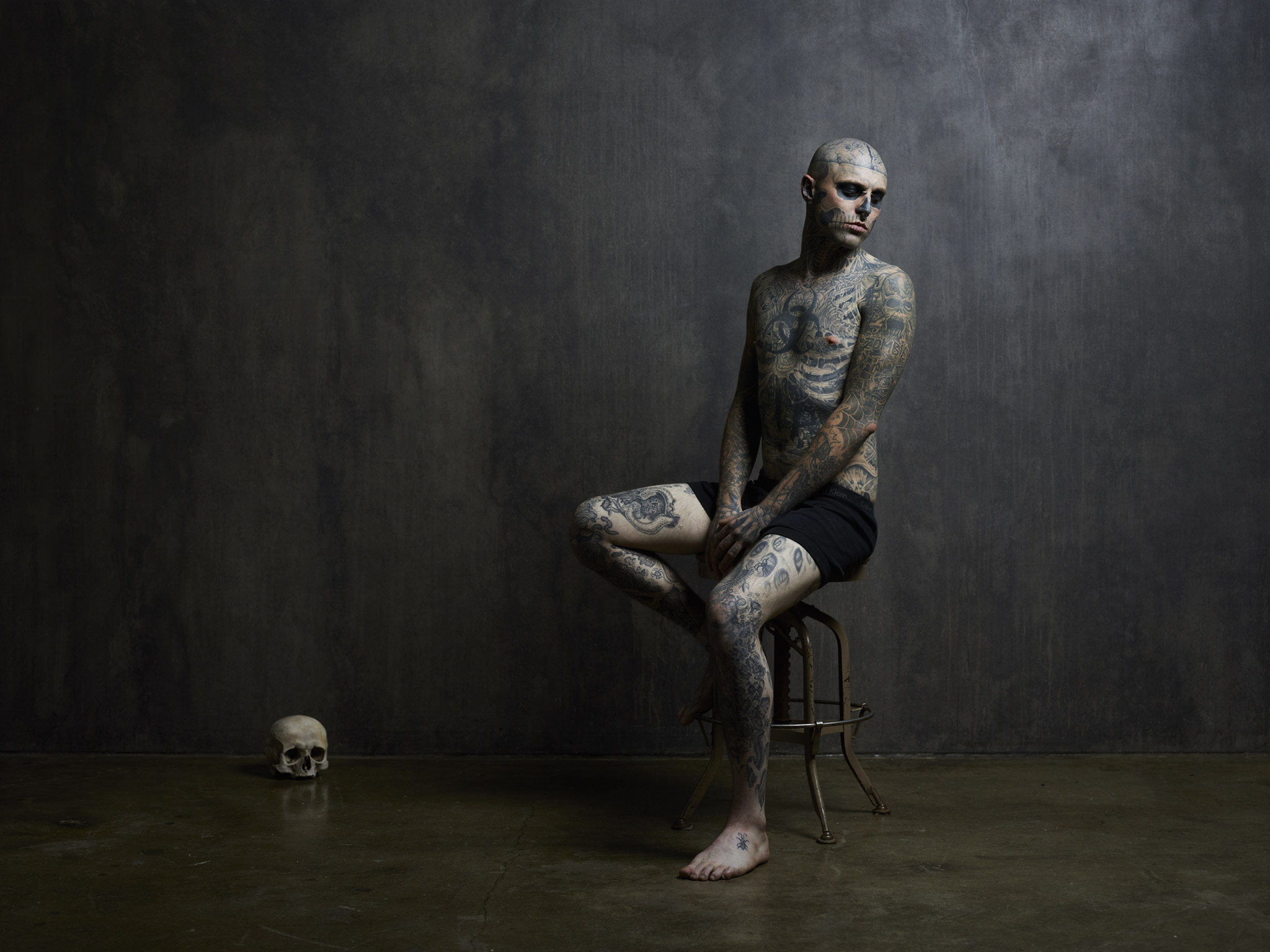
Zombie Boy
MOTION
ON SET
Photos
Dudes With Cameras
Travel Videos
BLOG
TUTORIALS
SHOP
Kurdistan Book
Fine Art Prints
ABOUT
Bio
FAQs
Gear List
Contact
SUBSCRIBE
Overview
Quick Portfolio
Personal Work
Celebrity
Ads / Tear Sheets
Select Projects
Global Agriculture
Global Healthcare Heroes
ZAAF: Made in Africa
Kerala, India: Tourism Campaign
Jungle Gym
Canada Goose: Nunavut
Harmless Harvest: Thailand
Wateraid: Tombo’s Wound
Oxfam: The Mosul Corridor
Lavazza Calendar 2016
Guerrilla Fighters of Kurdistan
Jose Cuervo: Ad Campaign
US Army: Ad Campaign
Holy Men
Halloween In Brooklyn
The Omo Valley
The Mentawai
Killing Kennedy & Lincoln
FEED Projects
Zombie Boy
Motion
On Set
Photos
Dudes With Cameras
Travel Videos
Blog
Tutorials
Shop
Kurdistan Book
Fine Art Prints
About
Bio
FAQs
Gear List
Contact
Subscribe